Nivea Three Variant Skew & Labels
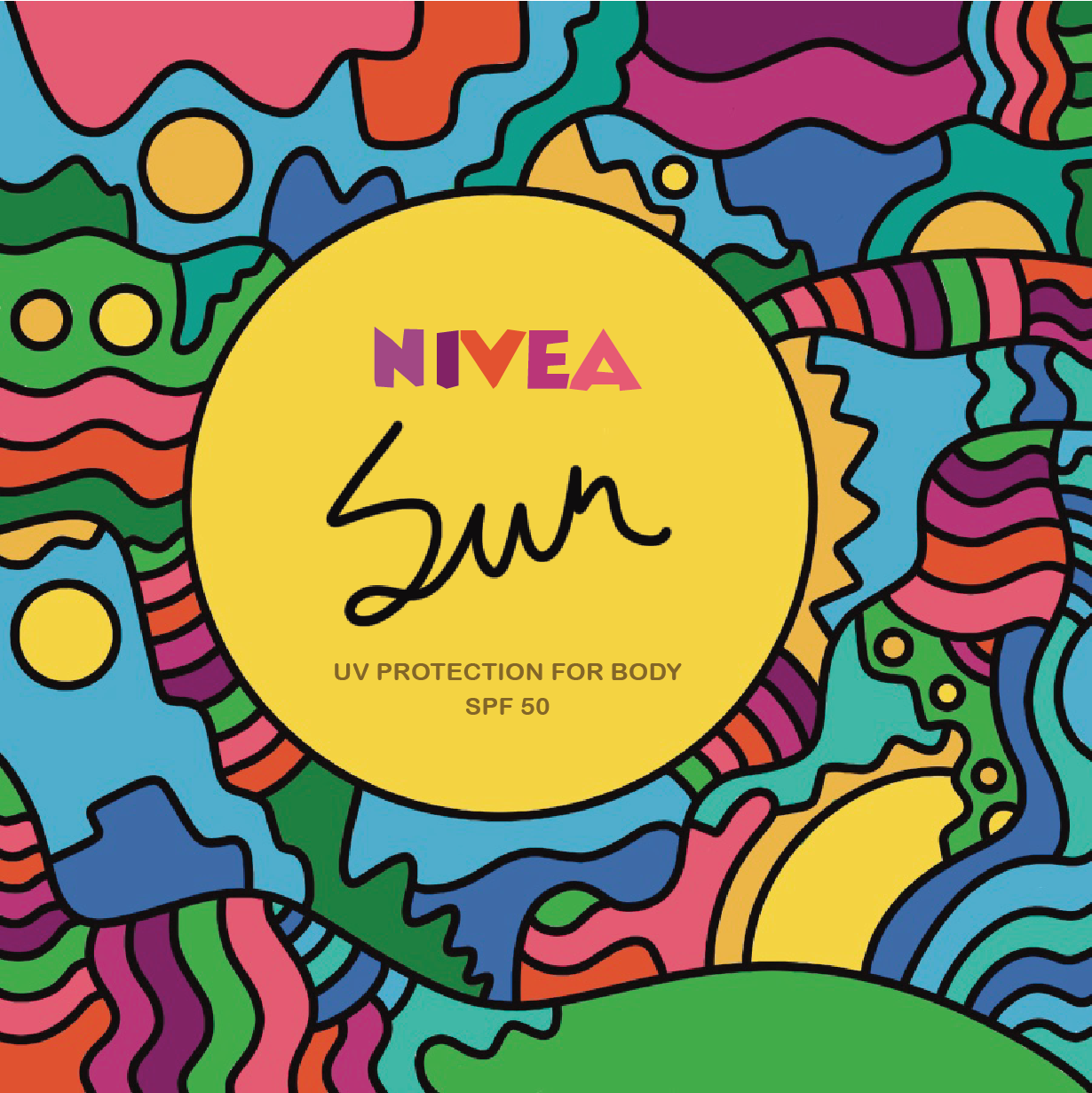
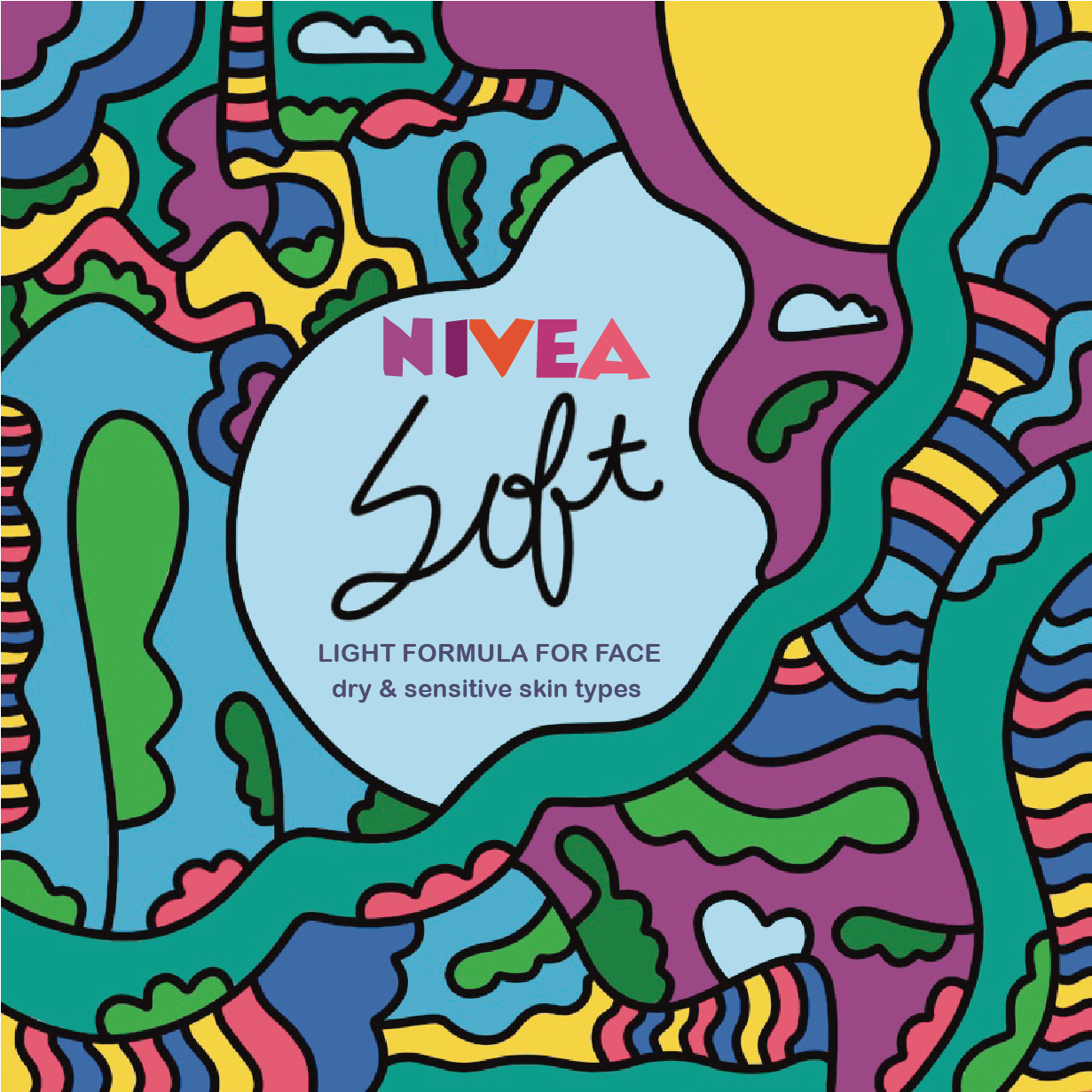
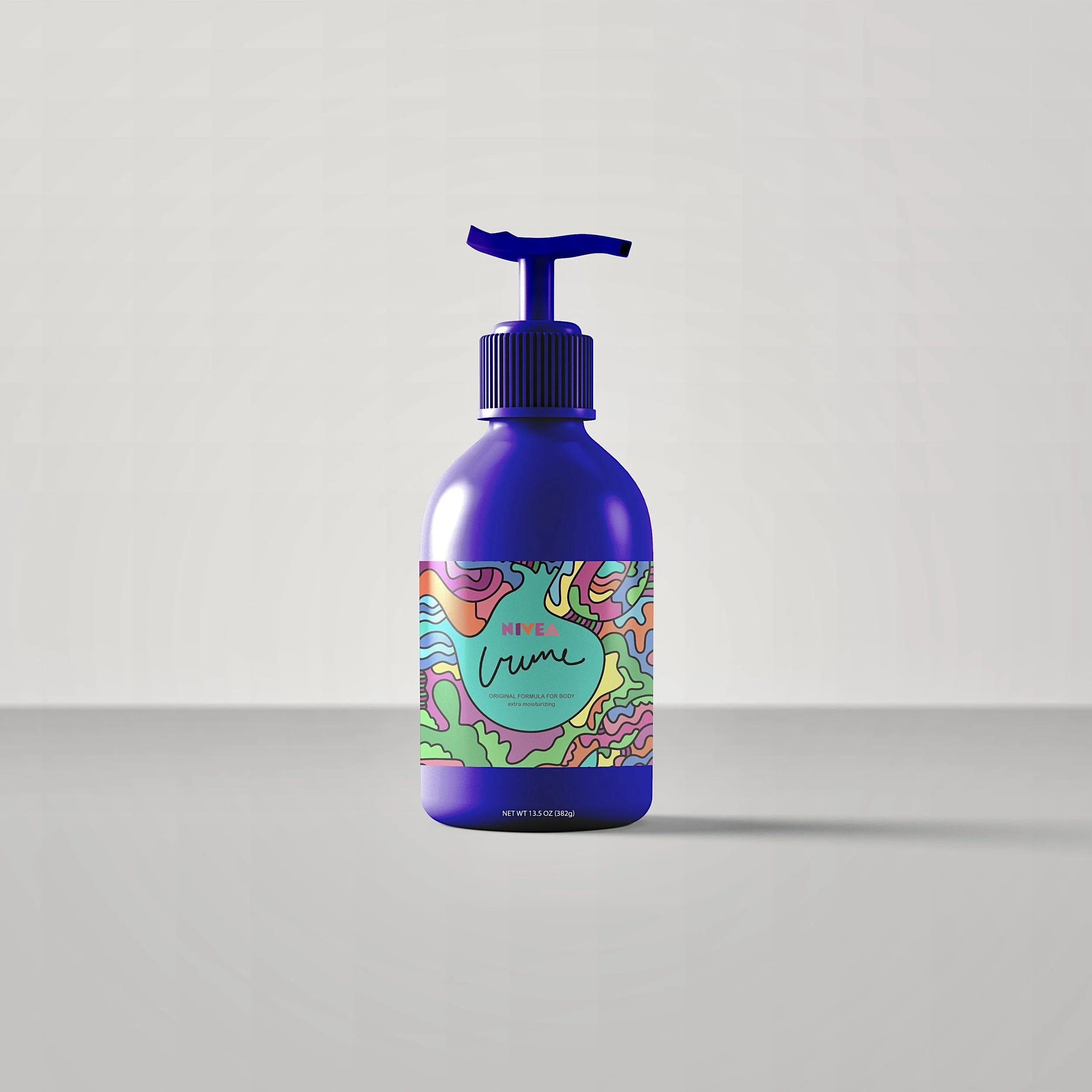
The project brief was to comprise a three-variant skew for a beauty/cosmetic line that would result in the construction of a label and invigoration of the brand. I chose Nivea so I could redirect the product’s universality towards topical use since this product’s overt moisturizing capabilities are too thick for regular facial use. I also picked this brand since its original design is minimal, making for an opportunity to include color-centric, graphic illustration elements, correlating to the product’s popularity and message that Nivea is adaptable and not outdated. This project was done using Adobe Illustrator, Photoshop and the iPad Pro’s Procreate. Photoshop was used to curate mock-ups used in the final presentation while Adobe Illustrator and Procreate were used in tangent to create the illustrations and typography.
Mood Board
I decided early on that I would redesign Nivea’s original Creme lotion, choosing Nivea’s Sun and Soft sub-brands afterward to show a consistent yet well-rounded family of products. I used this color palette as mild inspiration, ultimately adding richer tones of green, lighter blues and an overall brighter impact of colors than the moody, darker blues and purples that are present in my mood board.
Concept Sketch
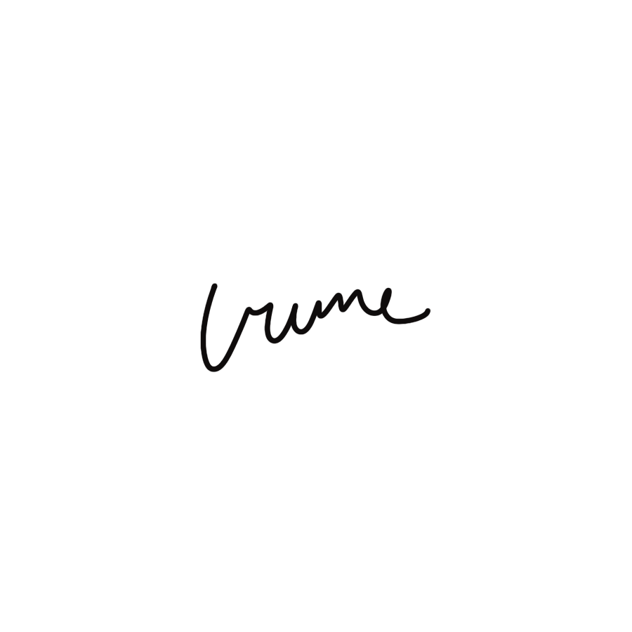
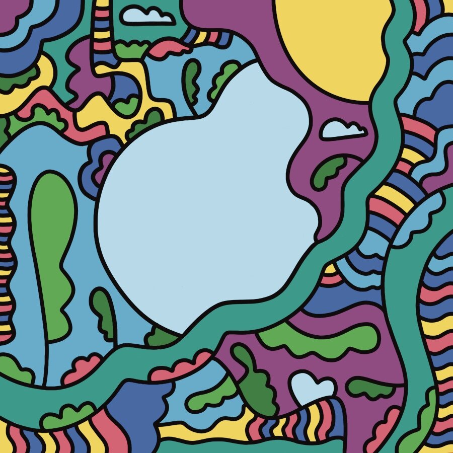
Inspired by my personal art sensibilities, I went with a seventies-inspired, fantastical, abstracted cartoonist style which includes organic shapes and pattern that maximizes the space. Using this process allowed for a variation between each product that still coincided with one another. I used this line language as an inspiration for the typography I later hand drew in order to further add consistency to the design.
Logo Adjustments
-

Too Big Of A Logo & Color Blends In
The first attempt at including Nivea’s logo in the design was superimposing and clashed with the color story of the illustrations. Additional text was also too large and wordy.
-

Too Small Of A Logo & Thick Keyline
The color story in this version of logo reconstruction matched the brand and illustrations. However, using a thick keyline made the logo hard to read and muddy. Scaling up the logo would make for a more proportionate design.
-

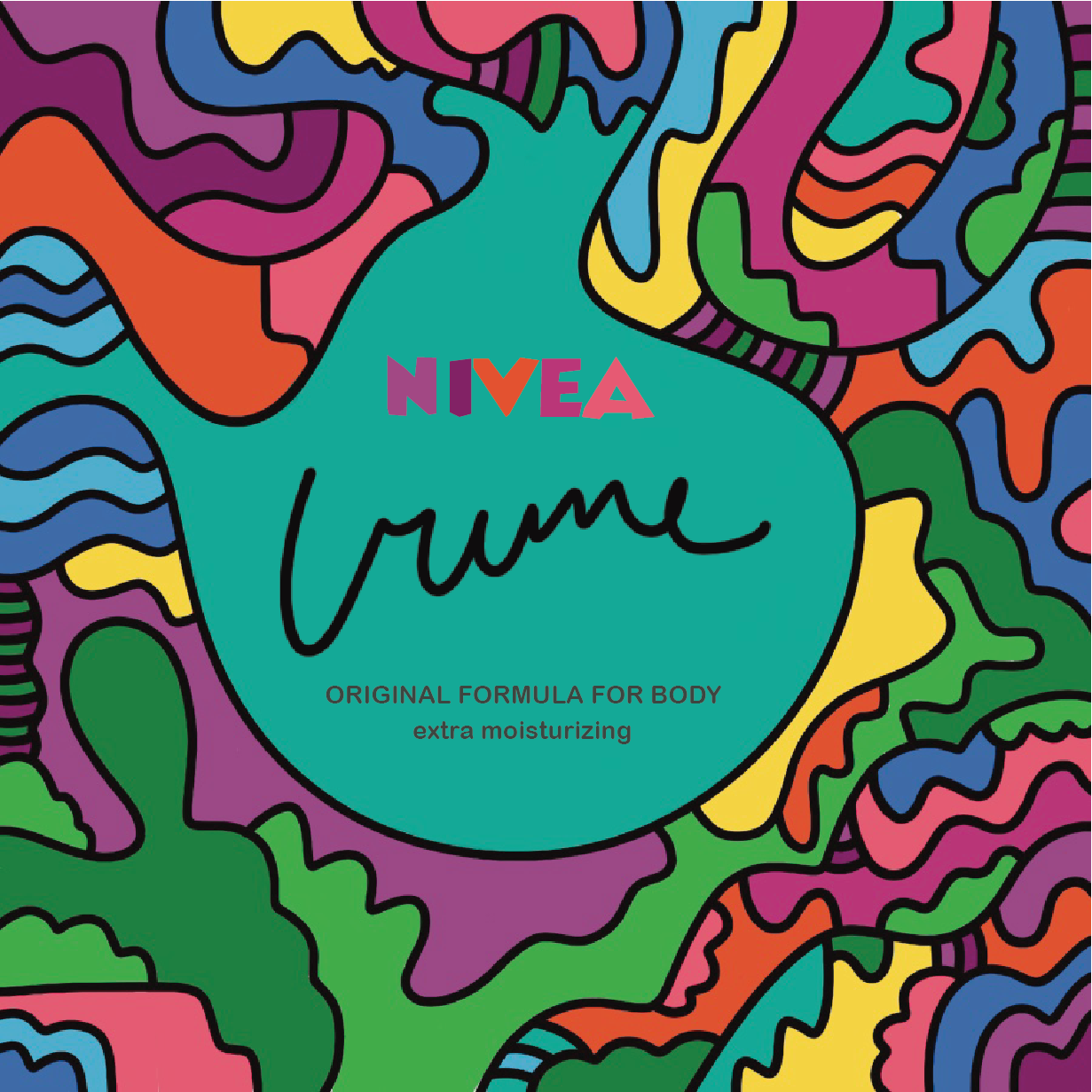
Final Design & Improvements
Nivea’s product name was scaled up compared to previous designs. The logo was scaled up, the stroke was removed and colors stayed unchanged throughout each final design skew.
Color Corrections Due To Lack Of Embedded Color Profile
-
Nivea Creme & Logo Placement Draft

-
Nivea Sun & Logo Placement Draft

-
Nivea Soft & Logo Placement Draft

Redrawing Imagery To Fit A Cleaner Composition & Match With Other Variants
-
Unadjusted Design
Nivea Soft diverged from the other skews because no center image was conducive to including type. Elements were also crammed and unaligned.

-
Redesigning Process
Wanting to keep the integrity of the original design, I decided to frame my illustration elements onto the left side of the canvas. This was so a center design element can be included.

-
Final Design
In the end, I went with a center image that was organic like the other two, yet include a touch of variation. This was so the design remained distinctive to Nivea Soft instead of mirroring another product in the skew.

