Moon Valley Nurseries Redesign & Branding: Logo, Stationery & Rack Card
The project brief was to rebrand a local business, first reconstructing their logo, then moving on to designing a stationery package and rack card that was also appropriate for professional use. Optimal research and extensive variations were required, going through a totality of renditions before working with the final logotype and related mark. Simplicity and refinement was a key challenge in this project, making sure the logo could scale down to a size needed for printed material and still hold its integrity without distorting, recoloring or blurring out. With a focus on production, files and related assets were saved in multiple color sequences, resolutions and extensions whether for print or digital media. File organization was another element of this project brief, creating folders that were easy to access and navigate, where documents were thoughtfully placed and labeled.
Keeping the consistency between the newly designed logo and branding material was another aspect of the design process, making sure no one element diverged from the style or color decisions that were made. The new look of Moon Valley Nurseries was not inspired by the company’s original look, ultimately straying away from the overt use of reds and advert style design apparent in their marketing which was confusing to their brand identity. When redesigning this business overall, I wanted to redirect their visual language to adhere to a sense of lux or quality that was evident in their services and pricing, as opposed to their brand message that they are cheap and have a commonplace affordability. The project was completed using Adobe Illustrator and InDesign.


Moon Valley Nurseries Original Logo
Although this logo is cheeky with a fun sensibility, it is unprofessional and immature considering the company’s birthplace and the services they provide, which are hands-on and more of a quality experience than their logo entails. Originally from Moon Valley Arizona, this business flourished in a conservative, private community with financial stability.
From humble yet successful beginnings, the company expanded to multiple locations including out of state, which is when their brand message shifted from the best trees straight from the moon to the cheapest and most affordable. Compared to competitors, Moon Valley Nurseries has a plethora of services and resources but were far from the most inexpensive.
Moon Valley Nurseries
Original Branding
Moon Valley Nurseries has a lack of design and refinement when it comes to the company’s brand materials. Their advertisements are overwhelming, busy and derivative to cheap advertising decisions commonly made in bad print or infomercial settings. Everything feels crowded without real intention, comprised of a slew of ads melded into one brochure no one has the eyesight or prescription to read without strain. Bodycopy is far too small.
When looking to rebrand these materials, I wanted to include the onslaught of information they originally used, along with photography and a more appropriate color palette to list prices, services and locations in an aesthetically pleasing manner.
Type Decisions Within The Logo Process
The first step towards completing Moon Valley Nurseries logo was analyzing possible logotype solutions. This is where I experimented with typefaces. When looking for an appropriate typeface I wanted a stroke that was in between thick and thin, so something overtly thin wouldn’t disappear when scaled down and something overtly big wouldn’t mush together. Source Serif Variable and Keefa were on either extreme of that medium.
Many of these typefaces had tight kerning to begin with, where many letterforms touch and cram one another. Within this rendition I started to think about character sizing, making an implied square shape by sizing each word separately. By doing this I ensured a longer word like ‘Nurseries’ did not outshine the others, creating interest with small and larger type selections that played into alignment.
First Set of Logo Variations
Using Athelas as my primary type selection, I began to play with kerning, leading, character sizing and casing as they related to a potential logomark. Adjusting the kerning was my first step, making sure either ‘O’ did not touch one another. My most profound decisions made within this version were experimenting with both upper and lowercase letterforms and choosing a more proportionate character size.
Logo Mark Exploration
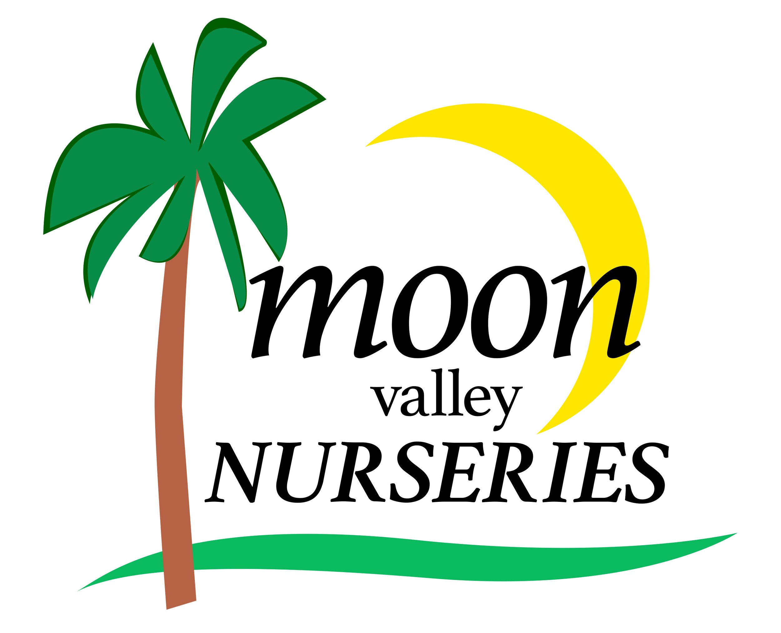
After solidifying a workable logotype, It was time to work and adjust the logomark. Using the moon as a primary shape, I included a palm tree to relate to the Nurseries’ popular tree selections as they added locations to the Southern California area.
Using the colors green and yellow rather than yellow and red relates to the idea of a nursery more, as opposed to fast food, caution or danger signage. Although the green half-moon was a cool concept, I could not refine the shape language enough to use it as a professional logomark. The trunk of the tree did not relate to the other visual elements since it was too small and segmented.
Changes Made Before Final
Logotype & Mark
Once all my elements were more solidified, it was time to make final changes to the totality of the design so each element can be curated and thoughtfully adjusted to work together as a whole. Spacing and sizing allowed for a more cohesive design to emerge, one that differentiated from competitors and one with more life and complexity. Rotating and resizing the moon was a worthwhile edit that refined the logo completely, whereas the previous version created pockets and tangents that were distracting since its center alignment competed with the logotype.
Another key change that brought forward the final design was the use of italicized letterforms. This allowed for more natural kerning between each character. The mark was also adjusted to create more meaningful moments of space and interaction, with the leaves of the palm tree now above instead of parallel to the introductory moments of text. The green shape towards the bottom of the logo was also edited. Its shape language was refined spanning past the longest burst of typography in order to frame and place additional elements. I also decided to remove the registered trademark icon from the right side of the design since modern-day Copyright rules grant this protection automatically.
Business Card Final Edits
-

Older Version Front of Card
The logo was deconstructed in this version, becoming a stark outlier where the final logo was not present. The logotype became an odd focus as opposed to the employee’s name on the card. This version was center aligned. An additional beige shape was added that gave focus to the company website instead of the associate’s personal information.
-

Older Version Back Of Card
The back version had a deconstructed logomark but was void of logotype, which looked inconsistent and large in comparison to the front. The typographical focus was misguided towards the company’s subtle tagline which did not add anything profound to the card’s communication. The location’s phone number was also included, making it the second extension listed which led to redundancy.
-

Final Version Front Of Card
The name on the card is given priority with his job title taking up one line. The final logo is included and unchanged. The phone number stands out amidst the beige and other details are left aligned, promoting optimal readability. The footer included the brand’s tagline, which became a way to frame other type elements in additional materials.
-

Final Version Back Of Card
Going in a different direction than the previous version, I decided to add brand messaging apparent in their original marketing materials such as their SoCal locations. I did not include duplicate locations, locations restricted to the public or ones that opened after Spring 2019. The canvas dimensions were also adjusted in the final business card, where the older version was incorrectly sized.
Stationery Design Final Edits
-

Superimposing Shape Without Purpose
Although this version was refined and related to the brand, it was still an outlier in terms of consistency. This treatment was not repeated anywhere else and didn’t feel a part of the visual storytelling already present.
-

Footer That Relates To Brand & Is A Vehicle For Communication
Using the same footer present in the final business card, I adapted a similar design to the final letterhead. The footer gave prominence to the contact information that was within it. The gradient was also adjusted to further refine the way it recedes.


