Thorne Family Farm Logo Design & Branding: Merchandise
The project brief was to design a logo for a local farm that did not have a logo to begin with. The logo had to be appropriate and professional since the brief also expanded to the relationship between local farms and k-12 school systems. The design was appropriate, fun and color-centric, something drawing a younger audience in without losing its sophistication. The logo also had to be overtly readable for viewers who could not discern ambiguous letter forms, and for those who valued boldness and clarity over busyness that served no function. This was a hard lesson to learn, being a maximalist designer there were challenges throughout this process that tested my capacity to simplify, reduce and take away in order to speak towards something more.
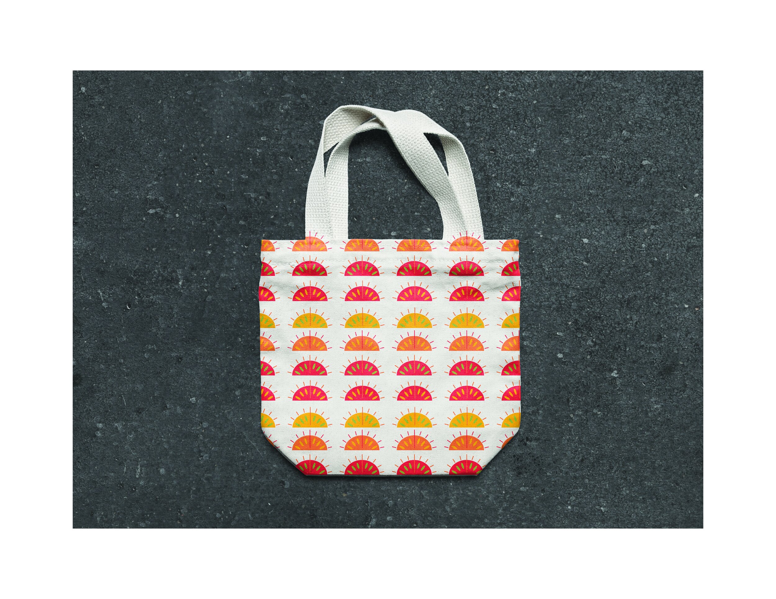
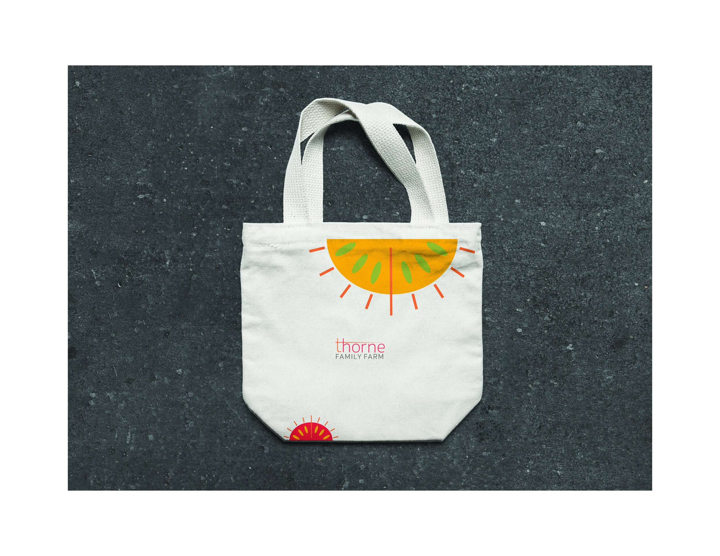
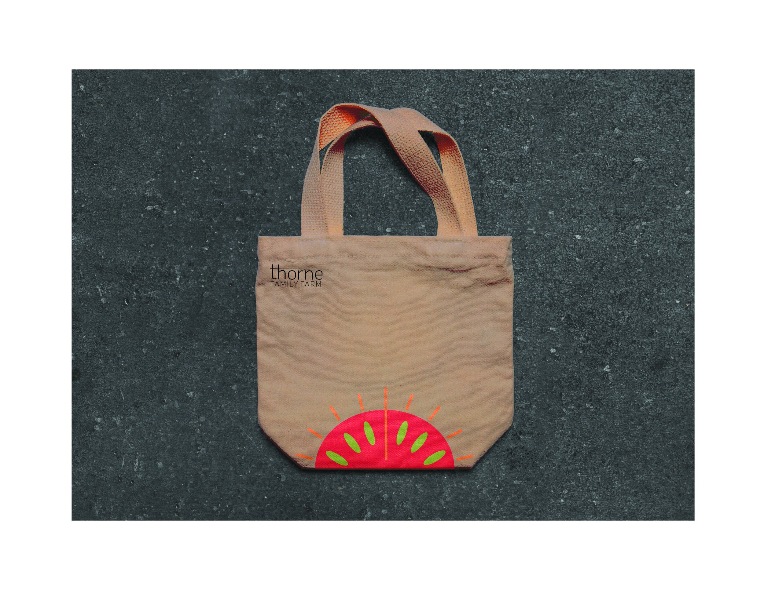
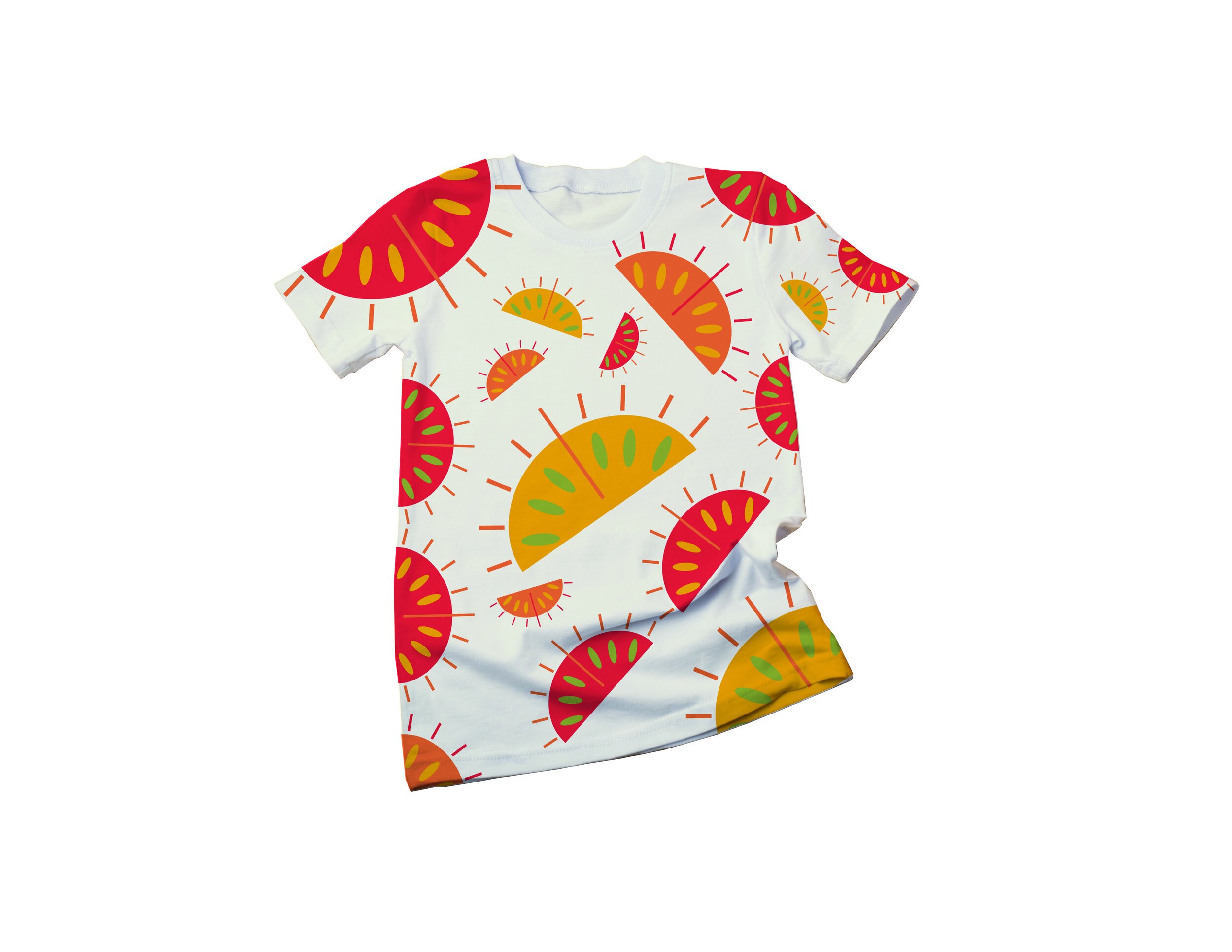
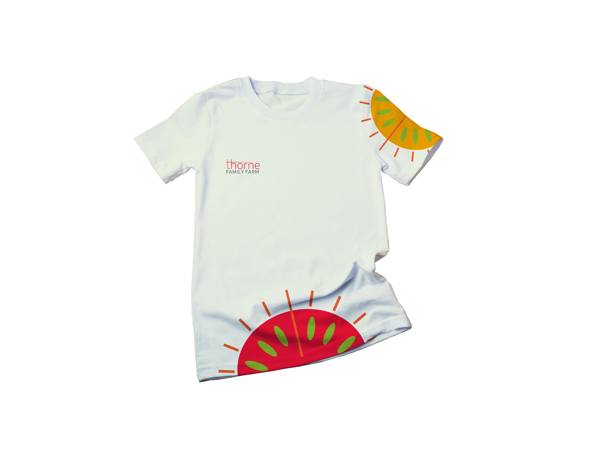
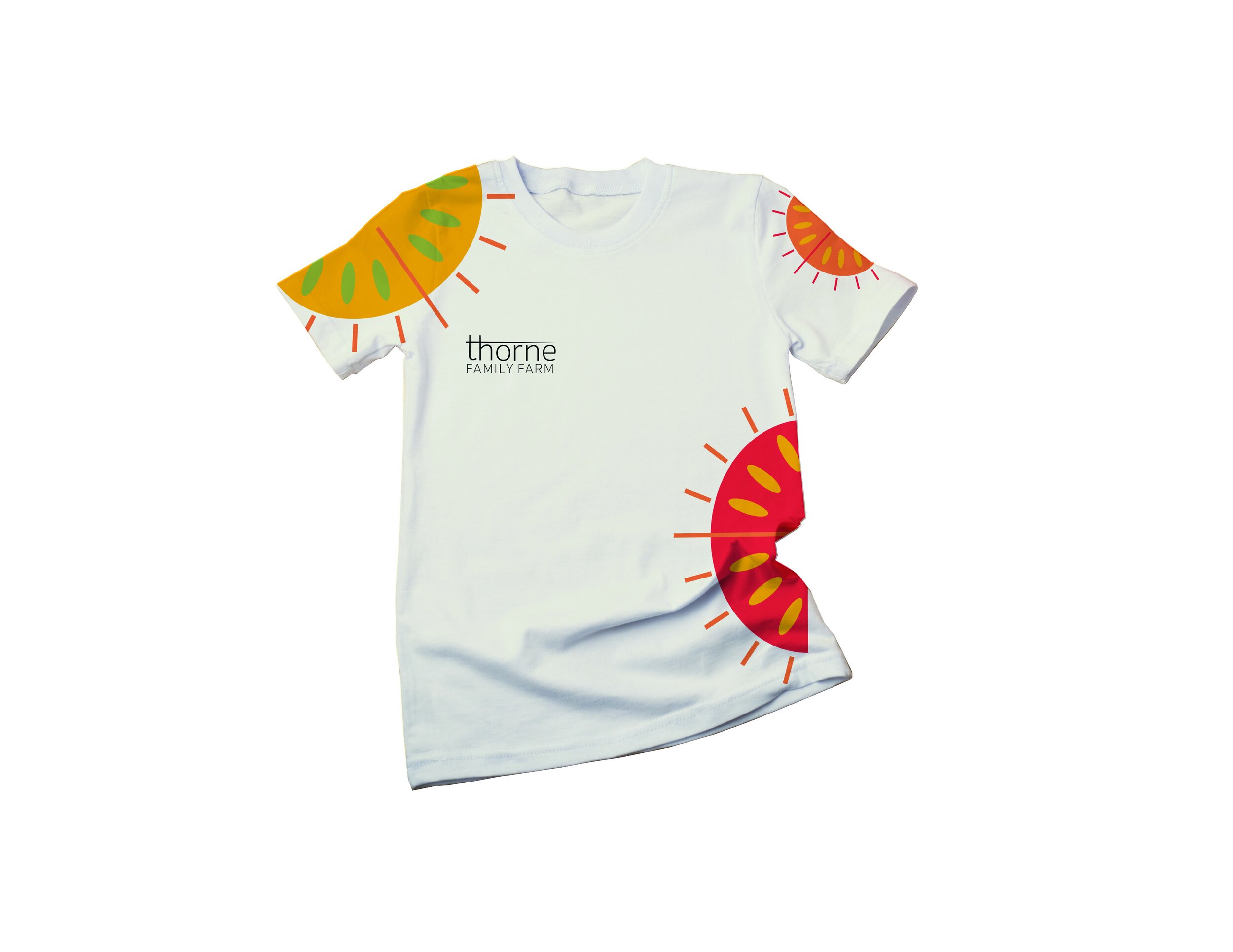
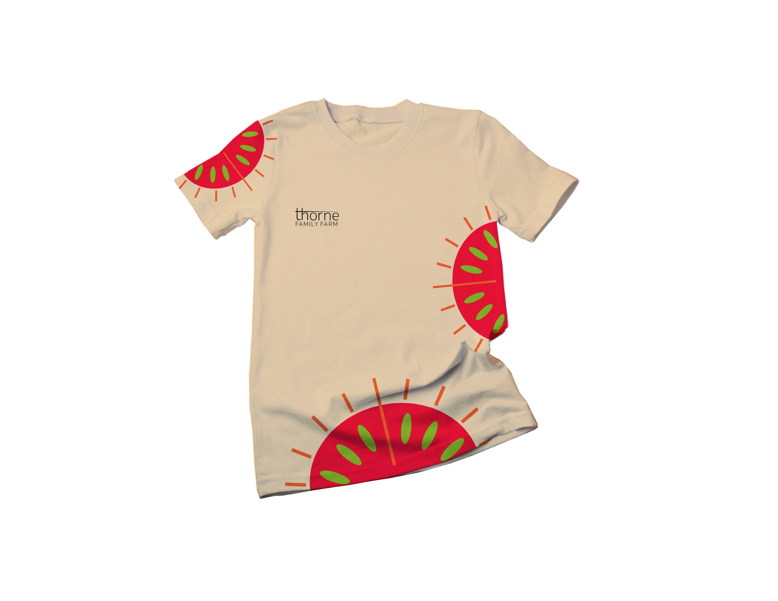
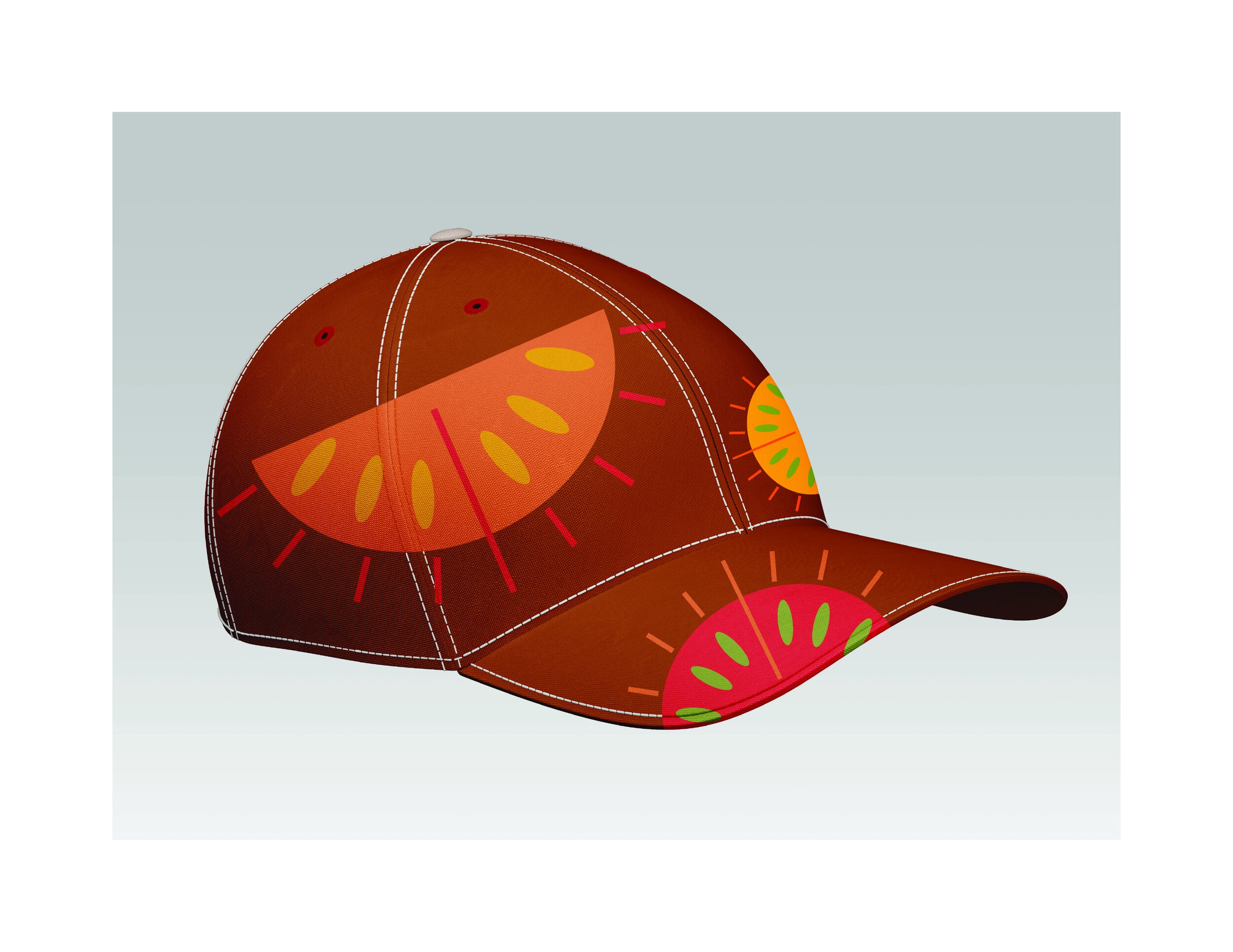
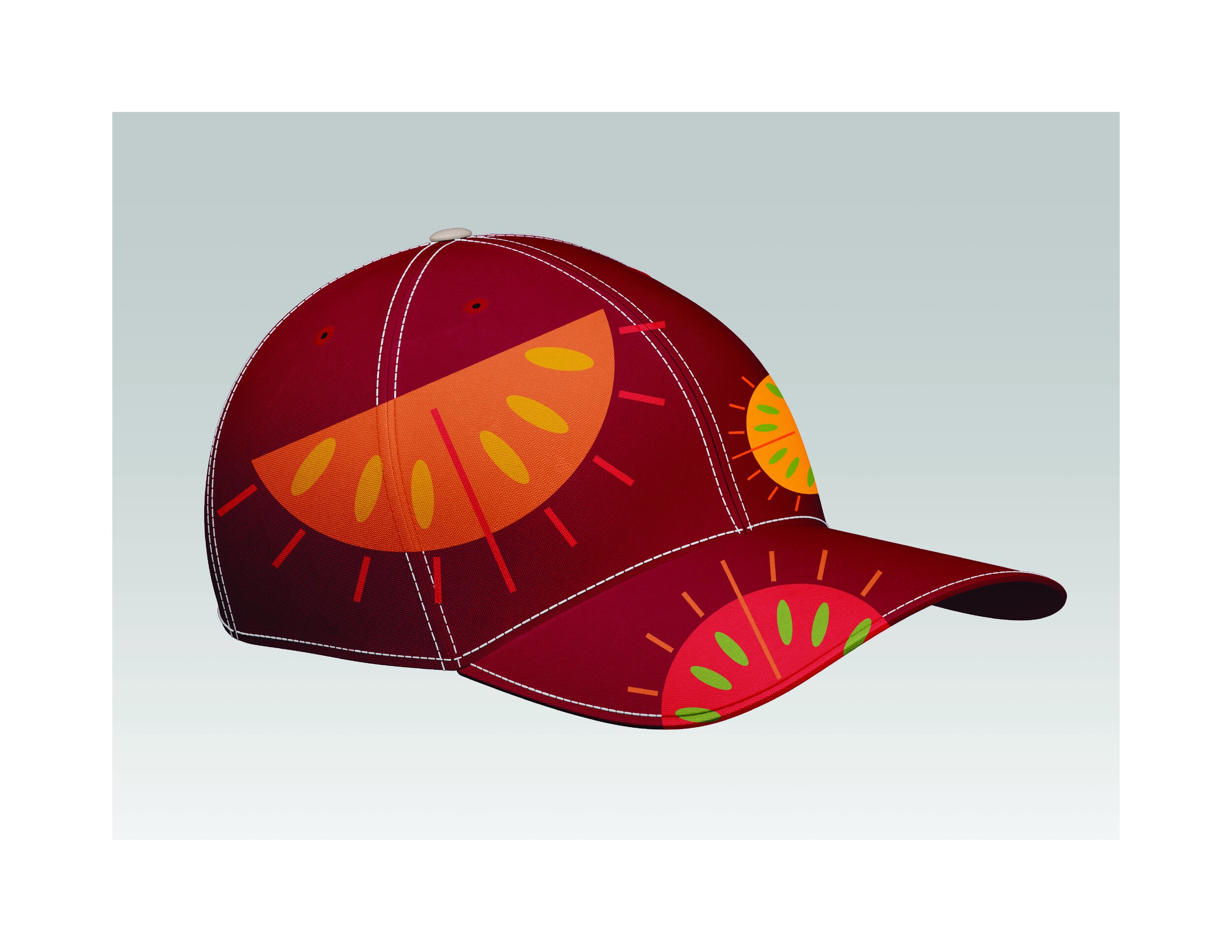
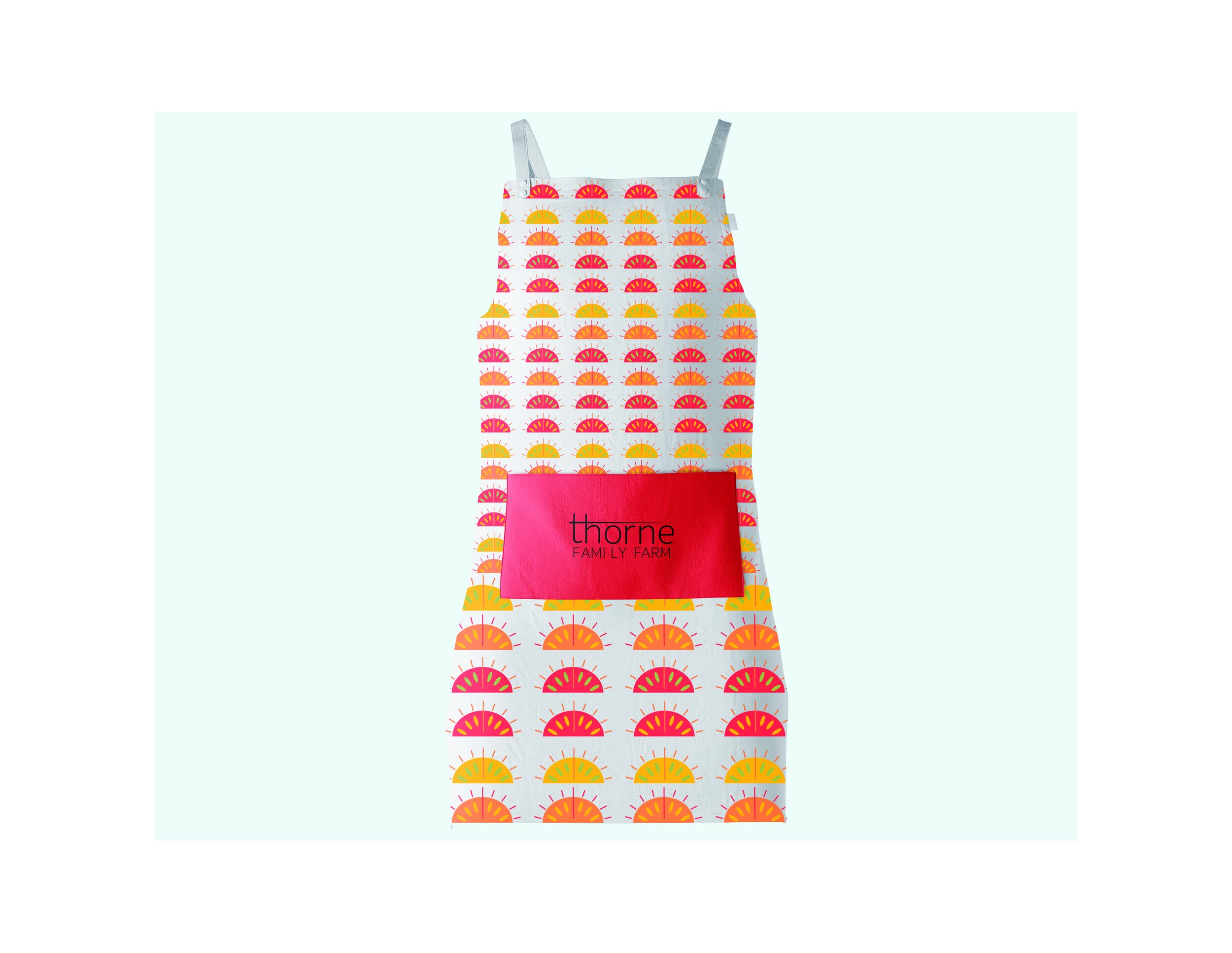
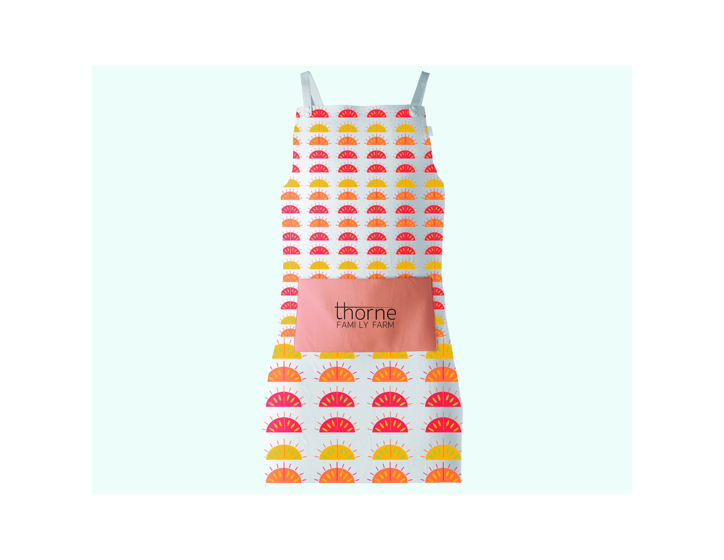
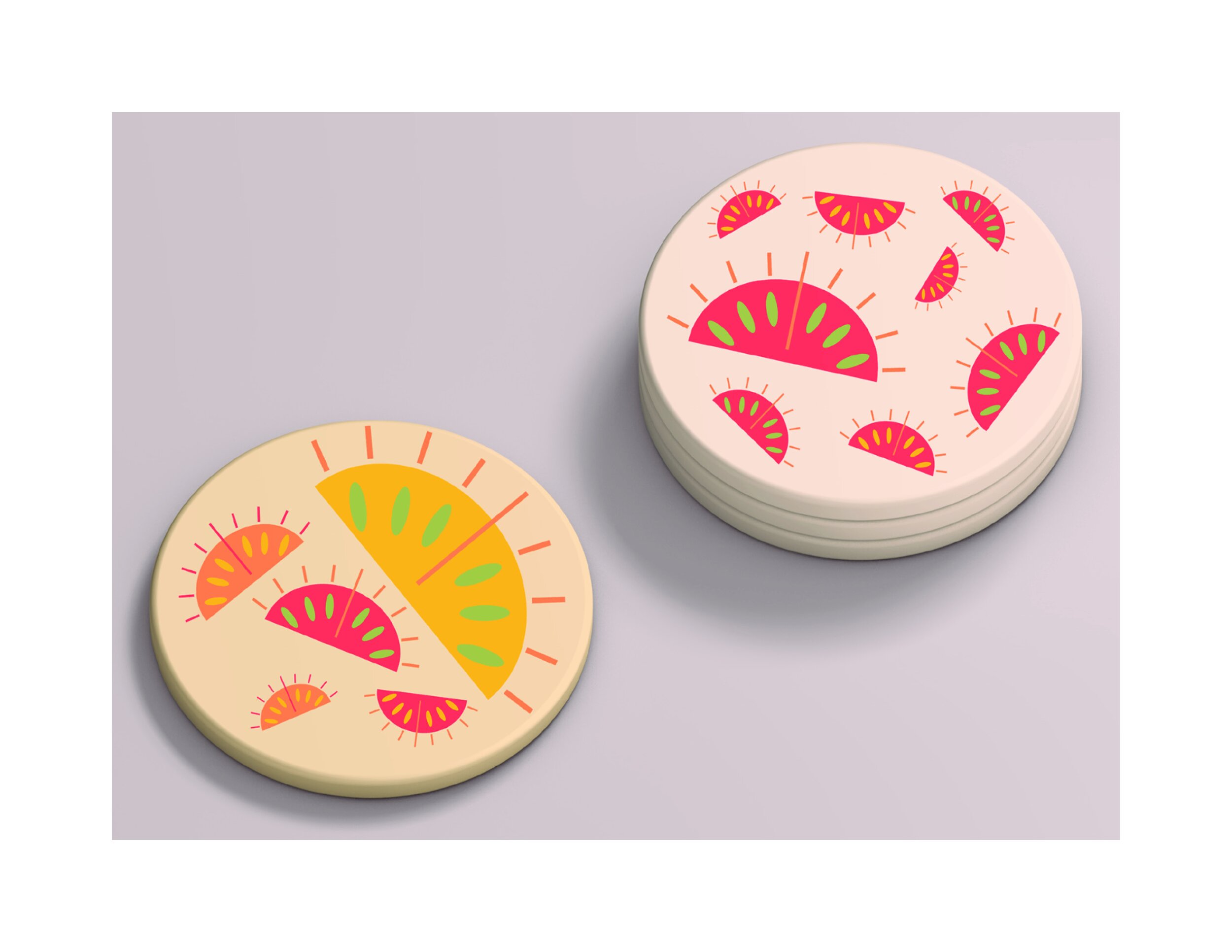
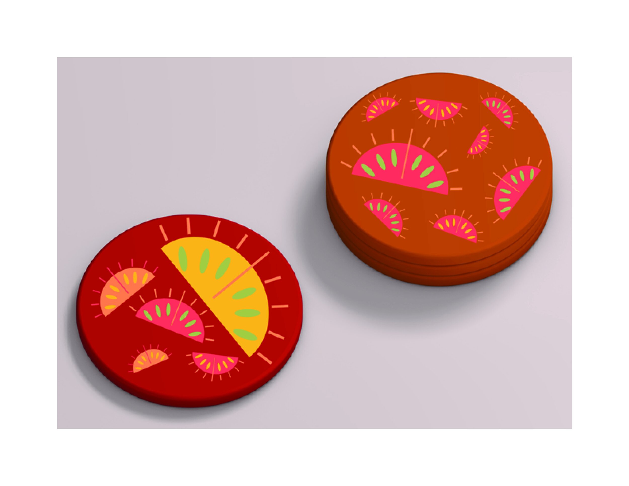
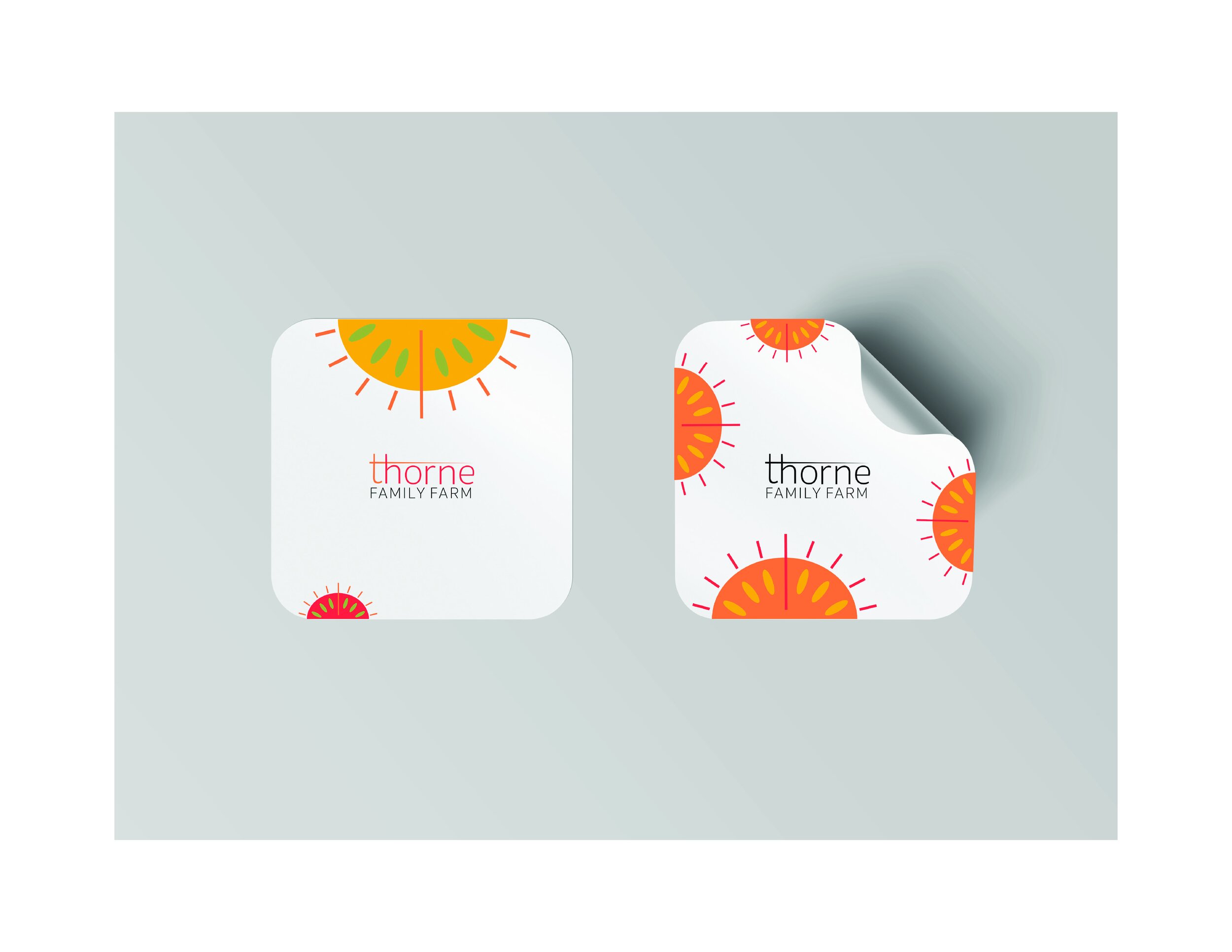
Merchandise branding was another layer to this project, having to include a final logo and additional branding elements to t-shirts, aprons, stickers, buttons, hats, canvas bags and a food truck that could deliver fresh produce to local schools. Having so many elements to design meant that my branding decisions had to be thoughtful and color consistent so they could still relate to one another. This project was completed using Procreate to develop and sketch my ideas, then moving on to Adobe Illustrator where those ideas were brought to fruition. Photoshop was used afterward to curate mock-ups for the project’s final presentation.














Mood Board
This mood board was beneficial to my overall color palette and shape formulation that I later used for my branding mark. The colors were inspired by Thorne Family’s renowned tomato farm, which has won several professional accolades, having been accredited with interviews and awards. The two photos spanning along the top of the canvas are actual images of their produce, which I color-sourced to use in the final palette.
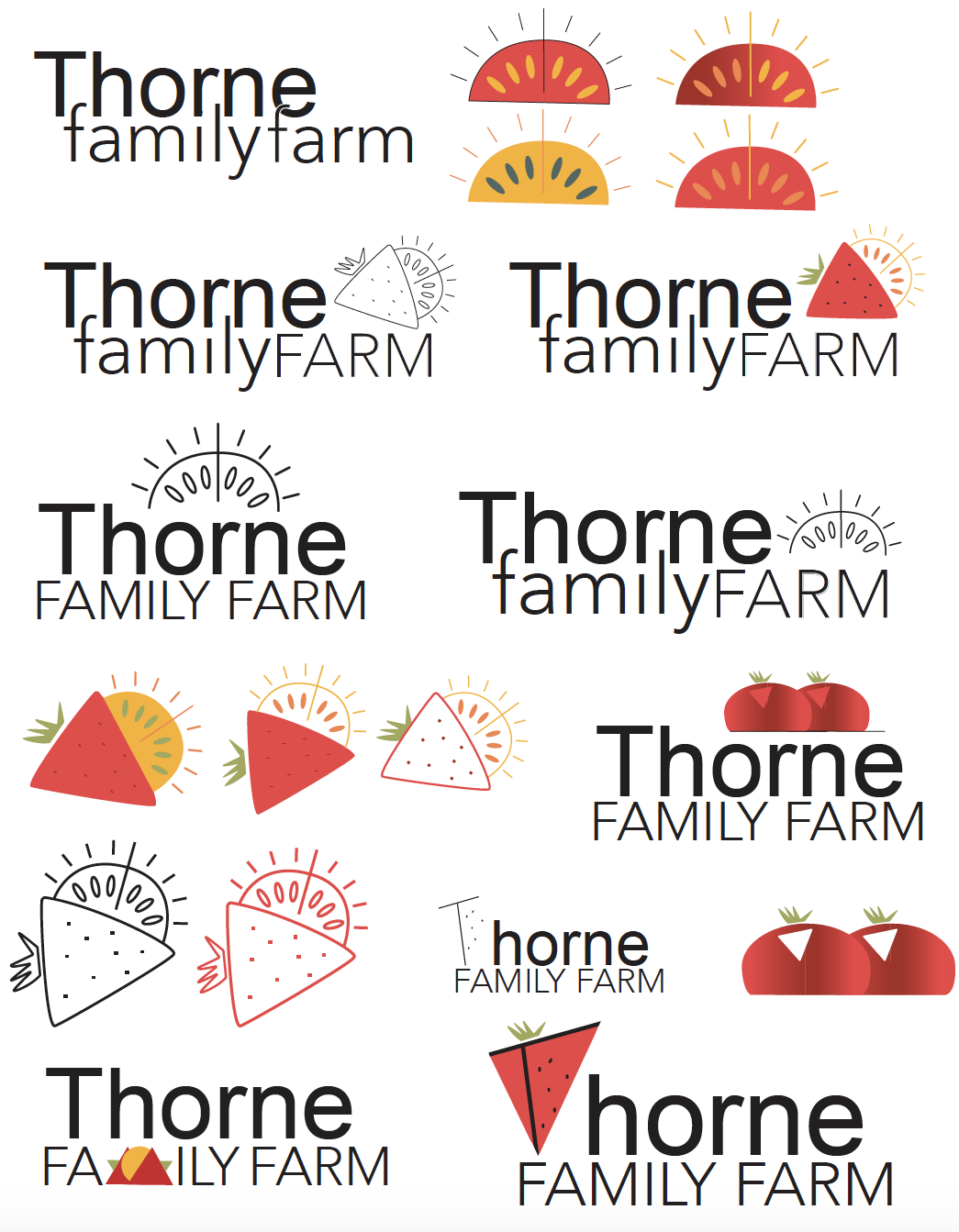
Brainstorming Logo & Mark
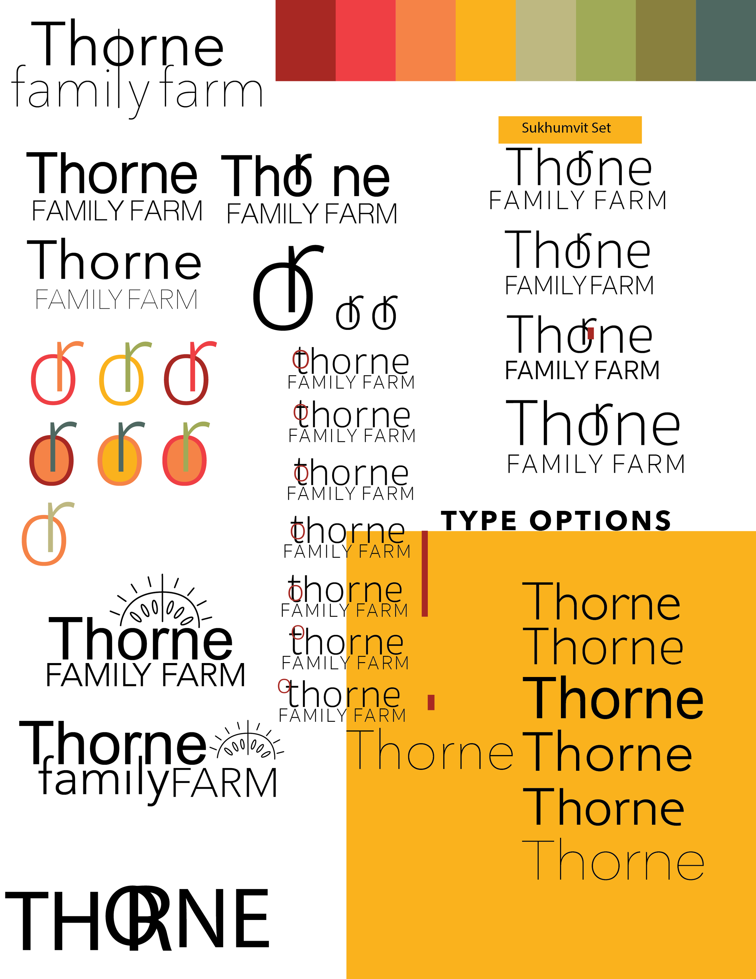
Initial ideas were well-intentioned however, typographical elements were too close together and lacked real finesse and impact. Thorne Family Farm is most known for their tomatoes, strawberries and oranges, which I attempted to include in the logo mark but ultimately used for additional branding materials instead.
Brainstorming Logo & Mark
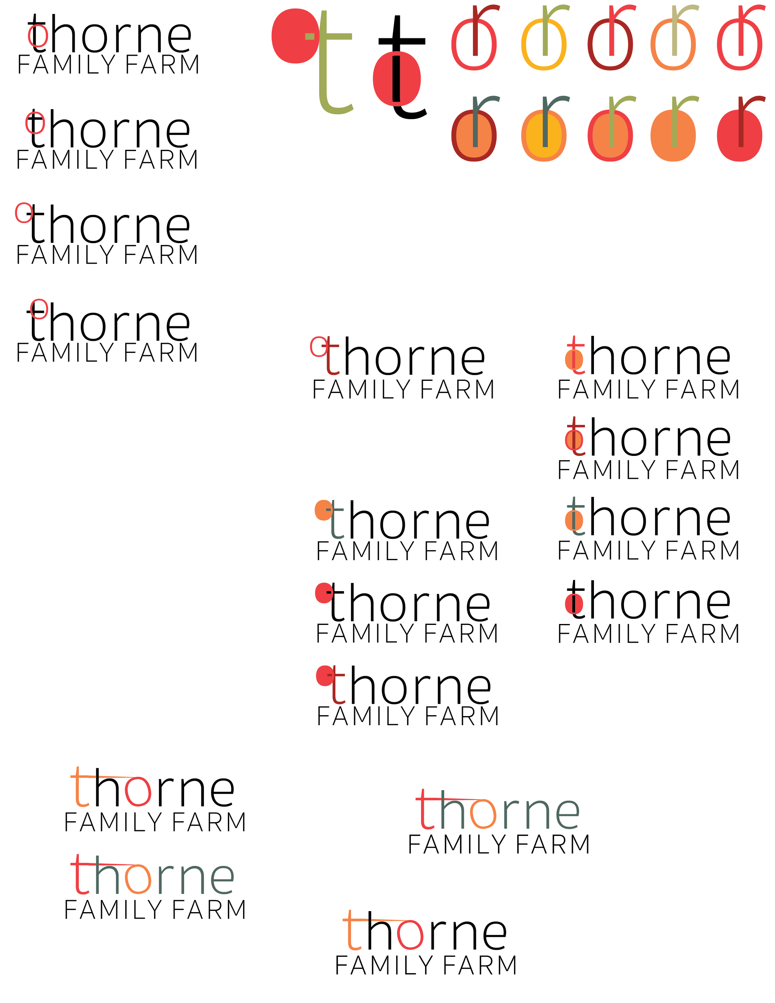
Throughout this project I excelled in outputting a plethora of versions that taught me how to refine a logo quicker and what to capitalize on for the future. These versions however could have been versified more, using serif typefaces, lowercase characters and more focus on type solutions and how they’re colored rather than mark integration.
Brainstorming Logo & Mark
In hindsight, the overall effect these logo solutions have are sterile and digitalized. They look like logos for a bank or law firm rather than for a farm. Although the palette was warm and inviting the typeface didn’t allude to the same feeling. This project was a game of tug of war, of constant editing, revising and rethinking.
Illustrator File Process & Work Flow

Logo Challenges Within Final Revisions
-

Initial Concept
Kerning in this version was not refined. It was also unclear that a tomato was hanging off a vine. A thorn began to appear, which became a better motif that also alluded to the business’s name.
-

Final Refinements
The letterform’s ascenders in this version were uneven which looked out of place in this design. The second row of text was also scaled down to improve the logo’s proportions. Editing the ‘t’ in the logo allowed for better breathing room and spacing since the t bar was too close to the h’s shoulder.
-
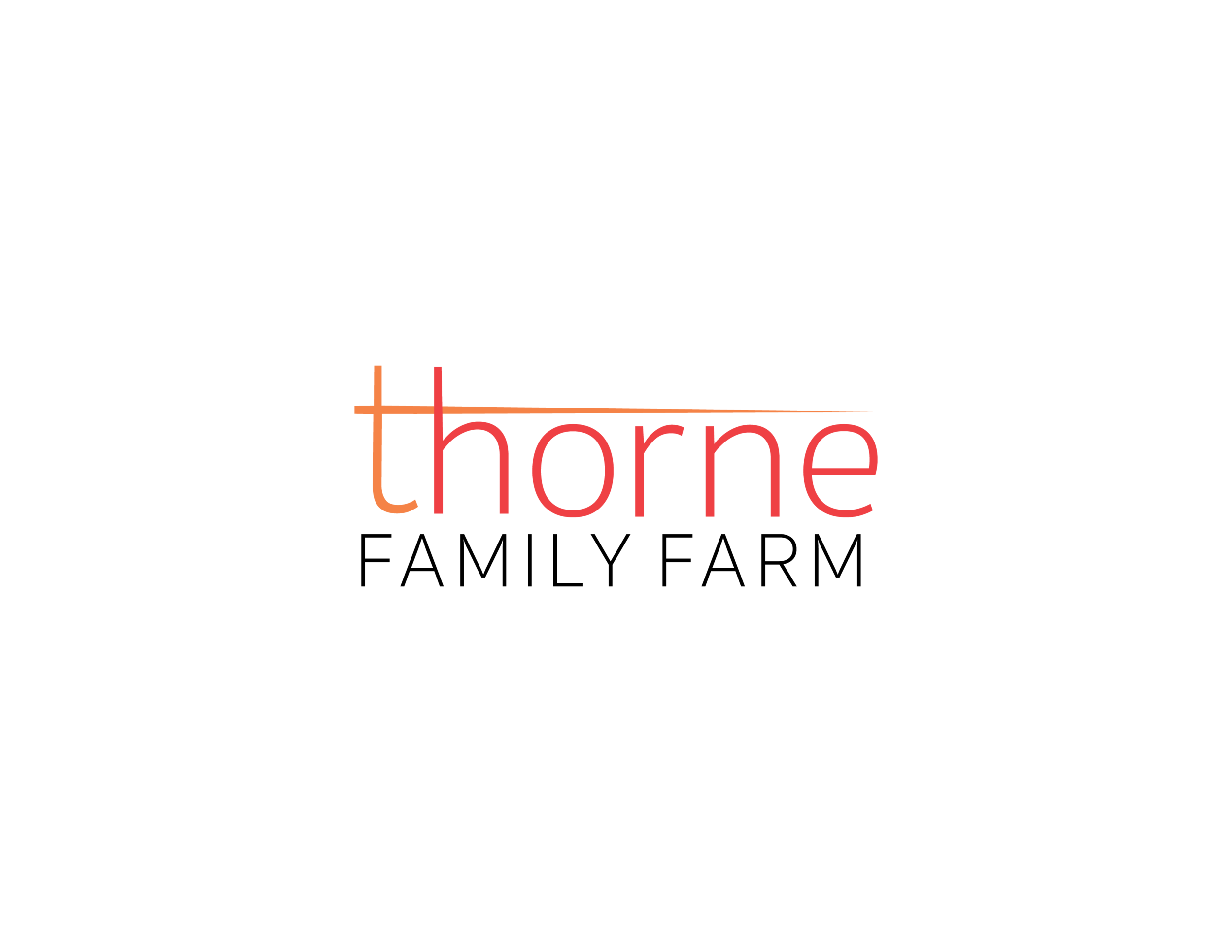
Final Logo
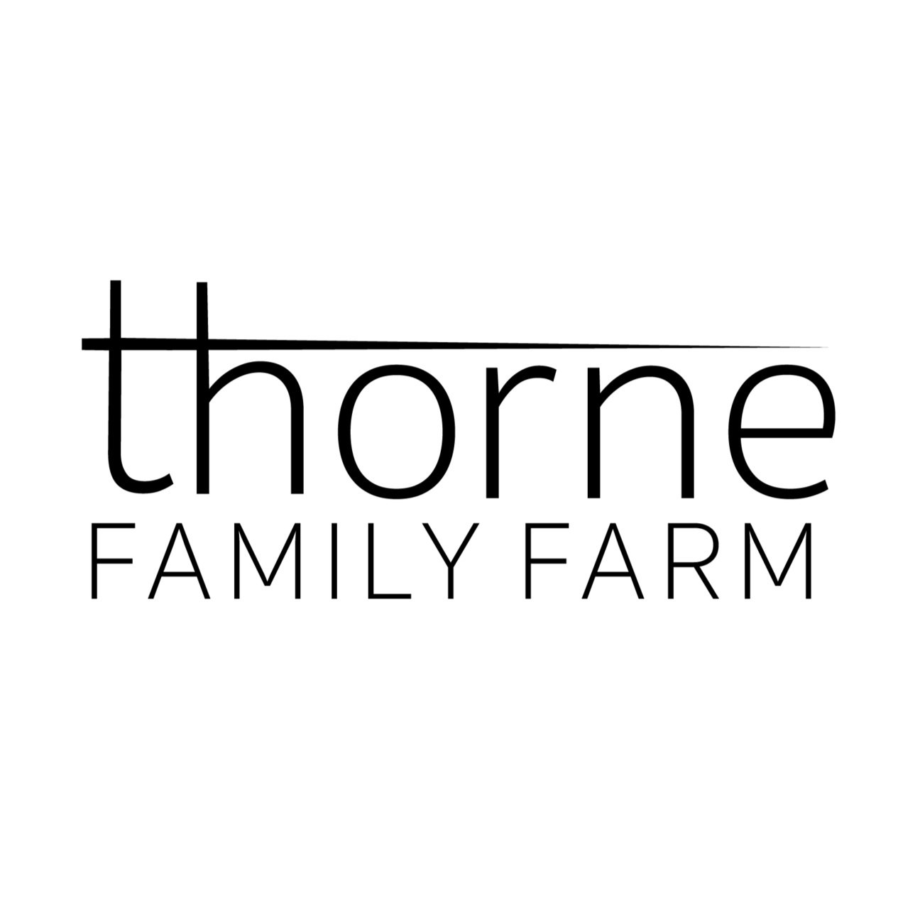
Another level of articulation that happened which improved the overall design was the adjustment of the horizontal bar that was customized and expanded towards the right which frames the logotype. The tapering is also much cleaner.


