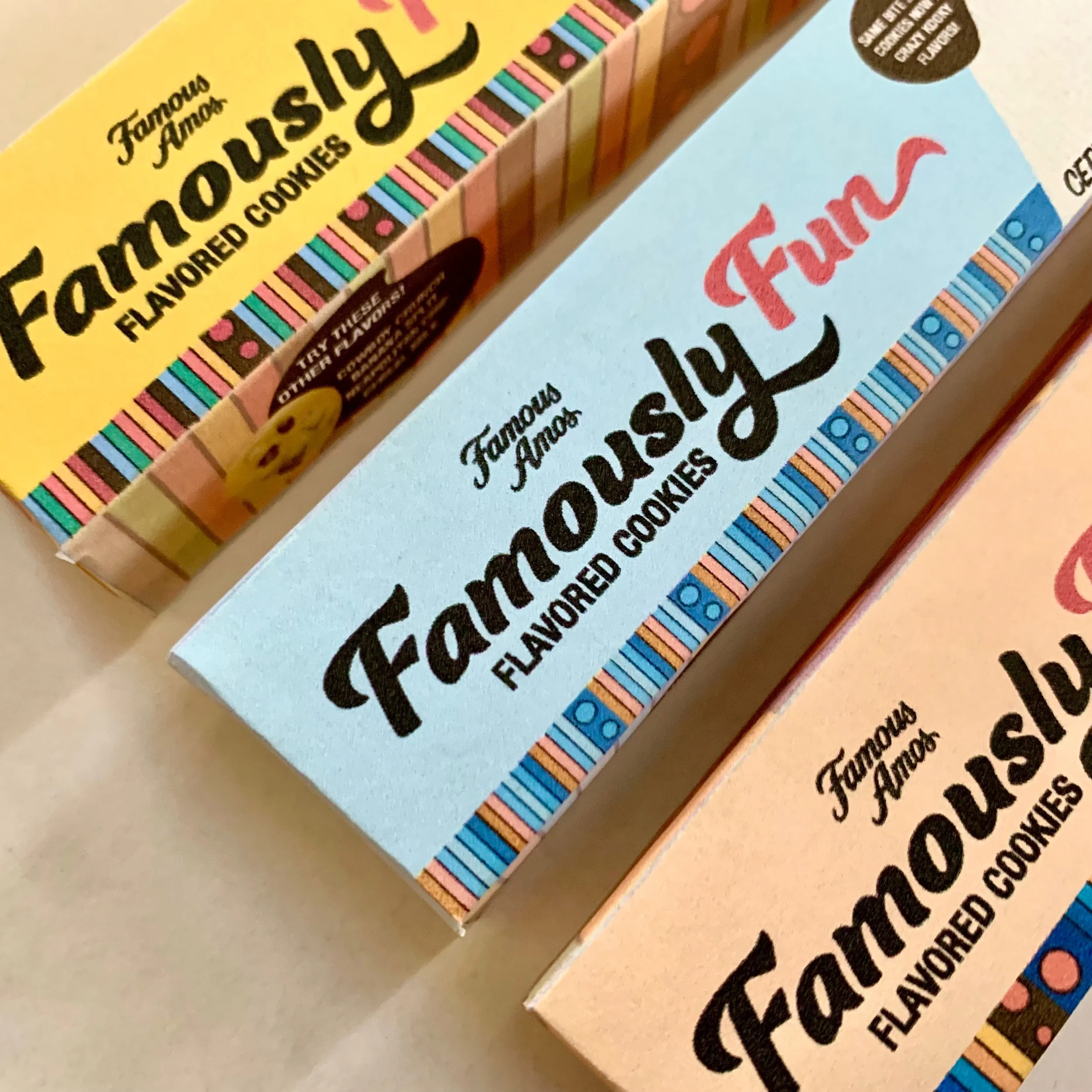
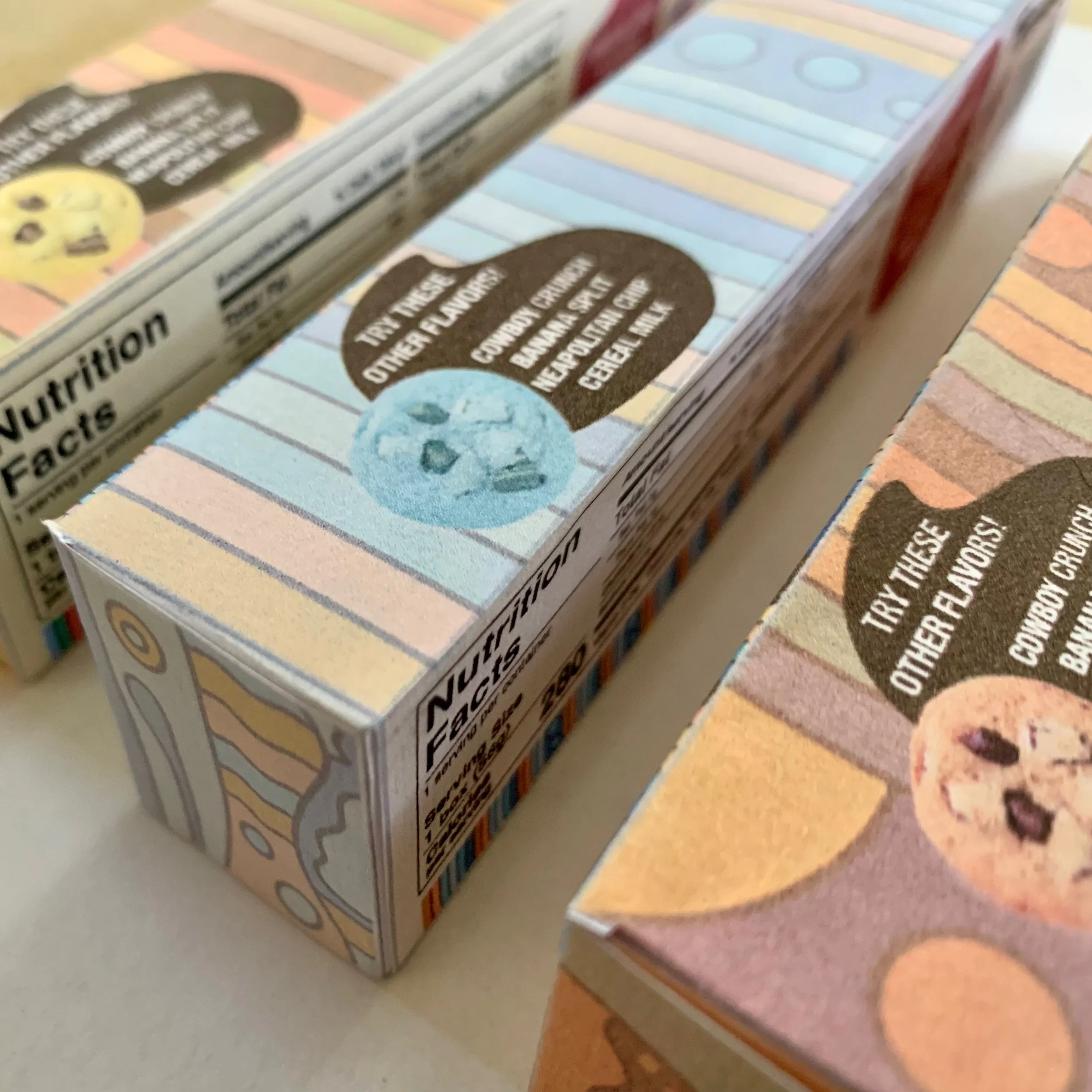
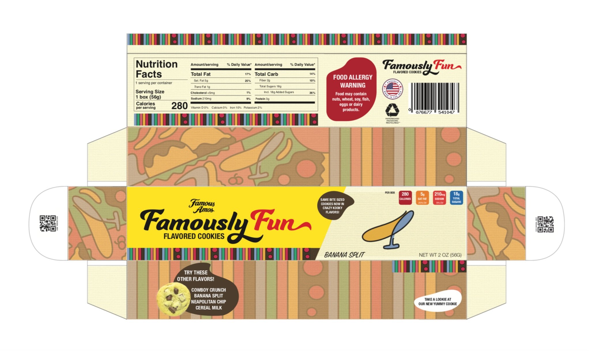
Famous Amos Sub Brand Packaging Trio
Project brief was to create a sub-brand for the existing food & snack company, Famous Amos. This project was an amalgamation of brand nostalgia and illustrative visual imagery paired with packaging solutions for their most frequently used packaging, a cardboard box holding product in bulk and sold individually by plastic bag. The expectation for the project was to offer a varied side to the existing brand, with skews innovative enough that didn’t disturb the integrity of Famous Amos’s original intention. With this in mind the project catapulted into its founding in the 1970’s, infusing flavor and vitality sparked in the brand’s opening years as a start up by minority & entrepreneur Wally Amos. Amos famously quoted the love for his cookies to be ignited by his children which probed the playful flavors that were chosen, Layer Cake, Cereal Milk & Banana Split. Catering to visual story and intention as it related to packaging solutions involved changing the size, shape, carrying capacity and protective scope of the packaging design. This was in order to evoke the feeling of larger quantities, shelf appeal and the authenticity brought on by the brand’s original founder that keeps parents coming and kids interested. More than anything, the original brand was meant to be a secondary accent giving way to the prominence of the sub-brand. Elements for this project were created in Procreate, Adobe Illustrator and InDesign with all elements on every skew created by me in totality with the exception of photographs that were edited in Adobe Photoshop and masked using an image from Famous Amos’s website. My only regret is not including the inside of the pack or an opened version of the design.

Mood Board Packaging Problem & Solution
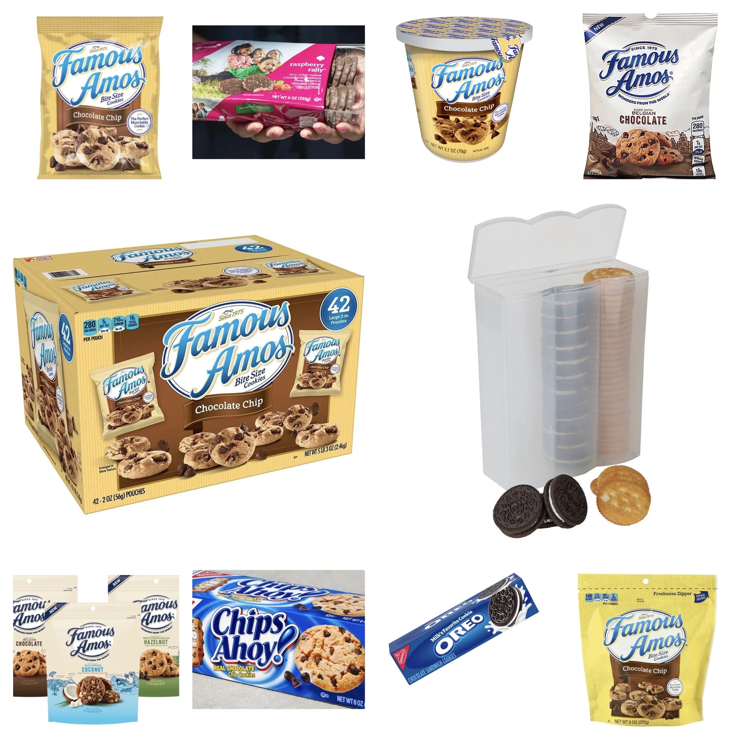
This mood board is different than others I do because it was focused on Famous Amos’s packaging problems & solutions specifically. I call this a mood board lightheartedly because it does not encompass my total vision and is not labeled or understood without explanation. Famous Amos most frequently sells their product in a large cardboard box carrying a large bulk. The cookies are sold individually but very infrequently. Inside the large box pictured middle left are 42 small plastic bags exemplified by the image above on the same side. Along the line that follows are several other methods specific or similar to Famous Amos which are all plastic, cumbersome and not resealable. The line below are improved packaging methods I took note of, including zipper-lined bags and box containers that offer more product protection. The image next to Famous Amos’s cardboard bulk box is a storage container I see most accessible for cookies without breaking, taking inspiration from Pringles cylindrical packaging (not pictured) that are famously known to keep the container’s contents further impervious to breaking.
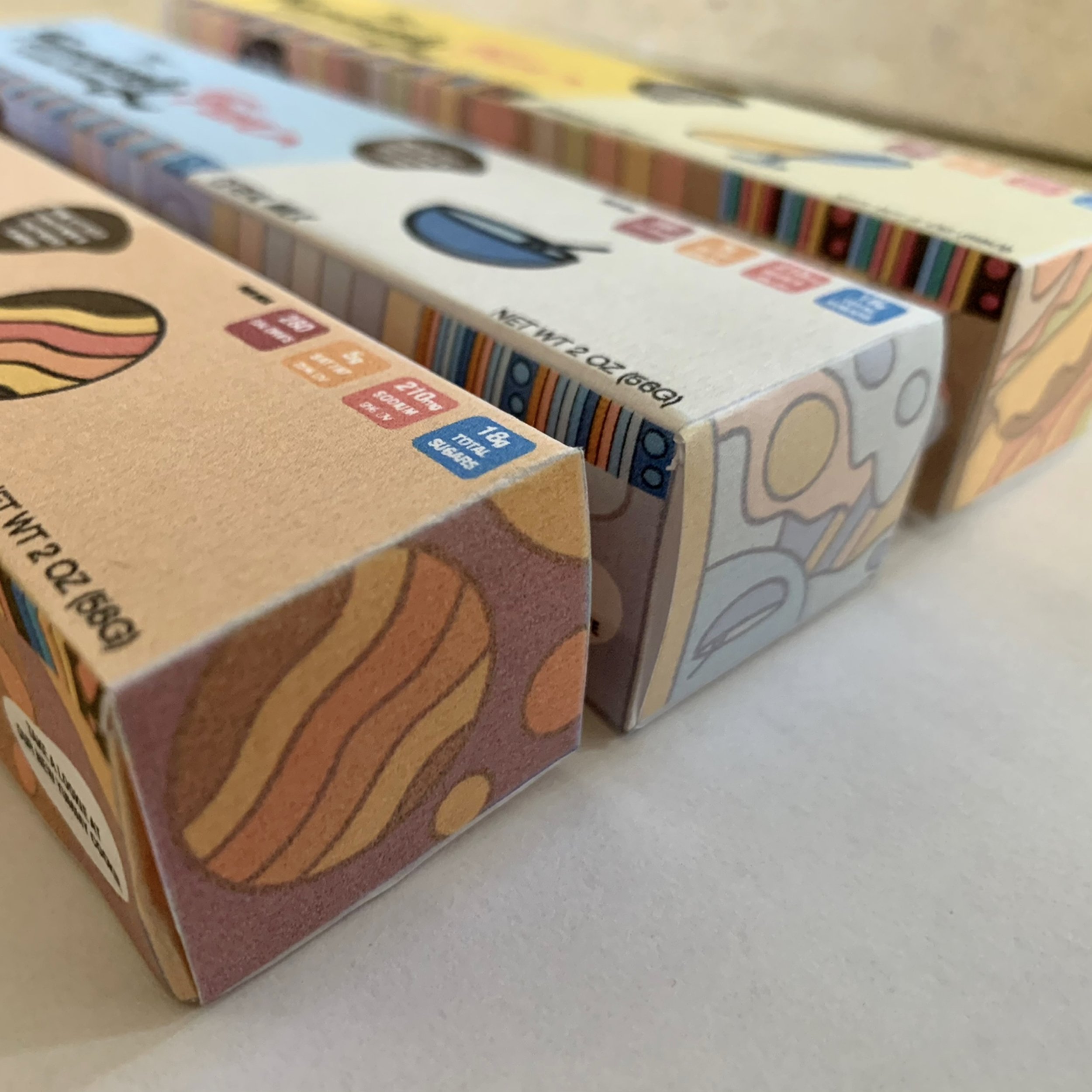
Using a rectangular cardboard box containing the average 8-10 cookies Famous Amos manufactures per package offers an alternative box method without having to buy in bulk. Creating shelf friendly alternatives allowed these variants to be sold in stores without dedicating much store space while still generating shelf appeal the original brand does not. Furthermore this sub-brand was an appeal to children & adults alike who are looking for flavors that surpass the traditional scope. They are indulgent, craveable and should be bought individually as a treat rather than an everyday staple for home which corresponded with the sub-brand’s intention to be a specialty counterpart to the overall brand.

How Wally Amos Inspired The Design Process
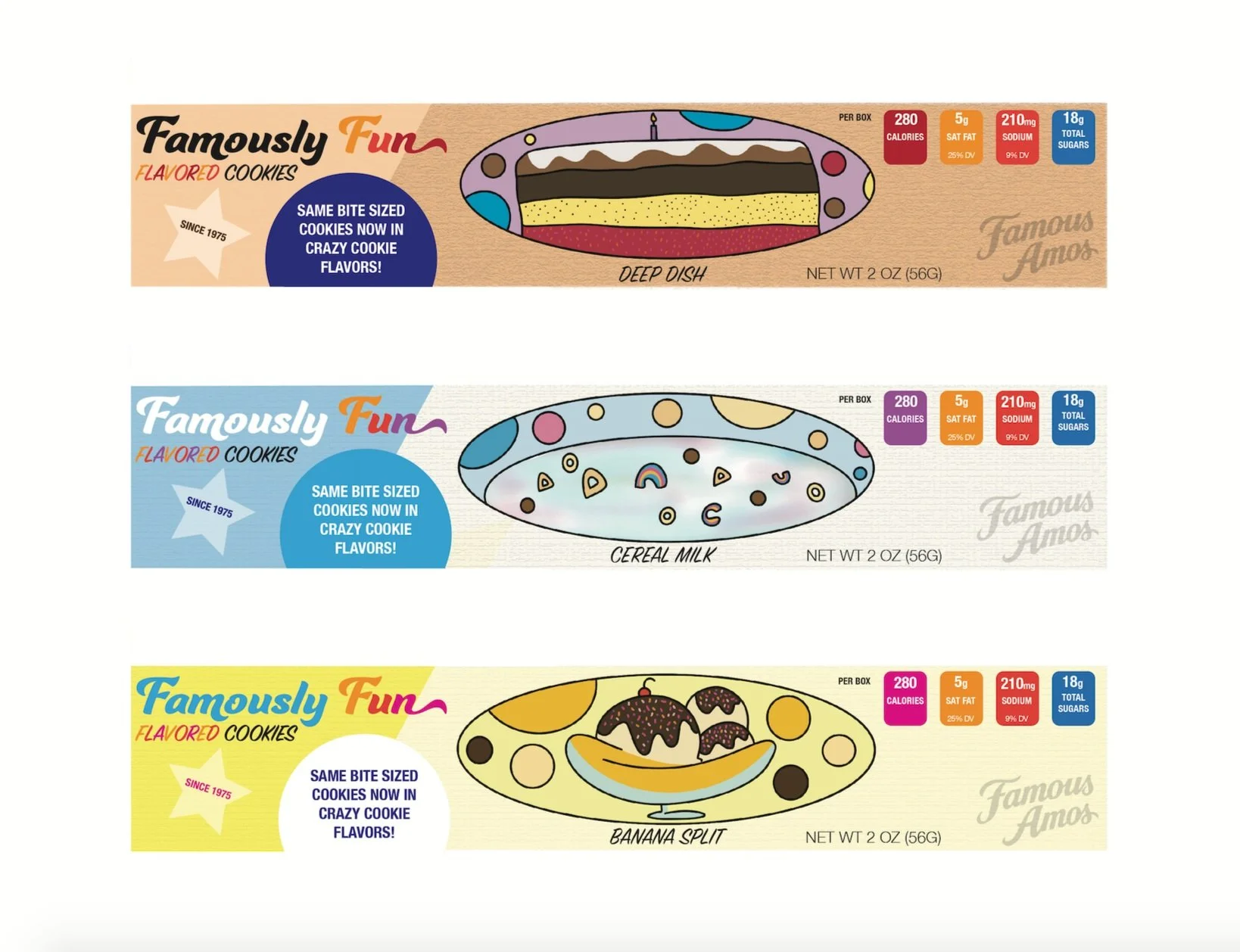
Wally Amos is the pioneer behind the brand Famous Amos, who’s home style recipe and warm appeal ushered the small business into the namesake it is today. Making simply stated and delicious cookies, Kellogg has since manufactured and sold the snacks nationwide. Wally Amos shared much of the experiences of his business and dessert-making with his son, sparking a connection which inspired the design process, incorporating nostalgic flavors you’d find & enjoy in childhood, but are hardly made in cookies sold in stores. This playfulness is eminent in the brand’s upbringing in the 1970’s correlating the unusual but welcomed flavor combinations. These flavor combinations are also exclusive to the Famous Amos sub-brand, Famously Fun which differentiates the variants from other options offered by the brand while still keeping cookies & flavors in mind.

Visual Style & Intention
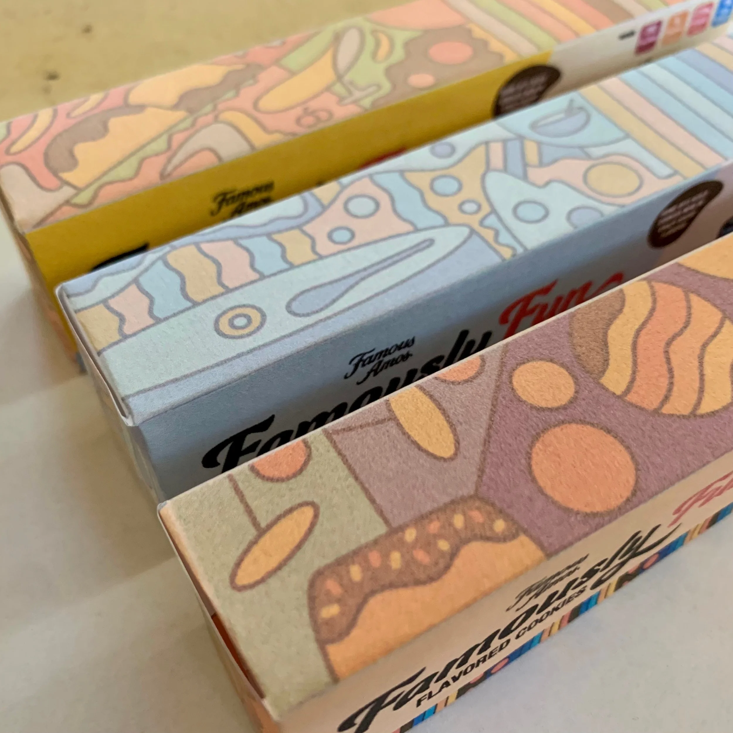
The visual intention of the three skews was at my discretion, using my illustrative capacity to illustrate each of the three cookie flavors I wanted to create. However, styling and proportion was inspired by international vintage style candy paired with a sensibility that would be suited for a candy boutique or world market. The design process as it unfolded informed the decision to make the sub-brand’s title large, similar to designs found in the image and examples shown. Color was also inspired by the visual aesthetic present in the image, using browns, blues and yellows dominantly in the design.
Initial Version & Takeaway
Although I was privy to these version’s illustration designs, the visuals were too large and overtook the skews. More so, the sub-brands title was made smaller and moved left because of this, making the type look cramped paired with the rest of the elements cluttered on that same left side. The flavors on each package were centered and placed below the illustrations making them hard to see and even easier to get lost. The nutrition tabs were also too large, taking up the same space as the sub-brands title positioned just parallel.
Edited Version & Takeaway
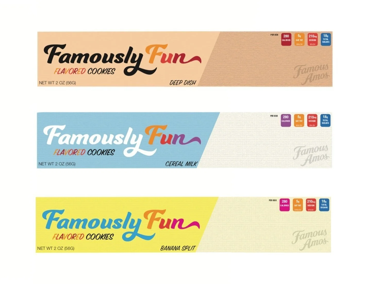
This design version carried refinement and a simplicity the other version did not, even if it included the illustration elements that were underway. The nutrition tabs although improved could be adjusted to maximize space and appeal. The titles of each skew were more visible with more breathing room but were placed too close to the color dip that made the type feel awkward. The subtitle under the larger type in this version was less readable because the multiple colors used, needing more simplicity and variety compared to the titles of the cookie’s flavors. The multicolored effect was reconsidered across all of the type elements. The original brand logo was also large, and did not need to be as prevalent as it was in this version.
Packaging Elements & Challenges Within Final Revisions
-
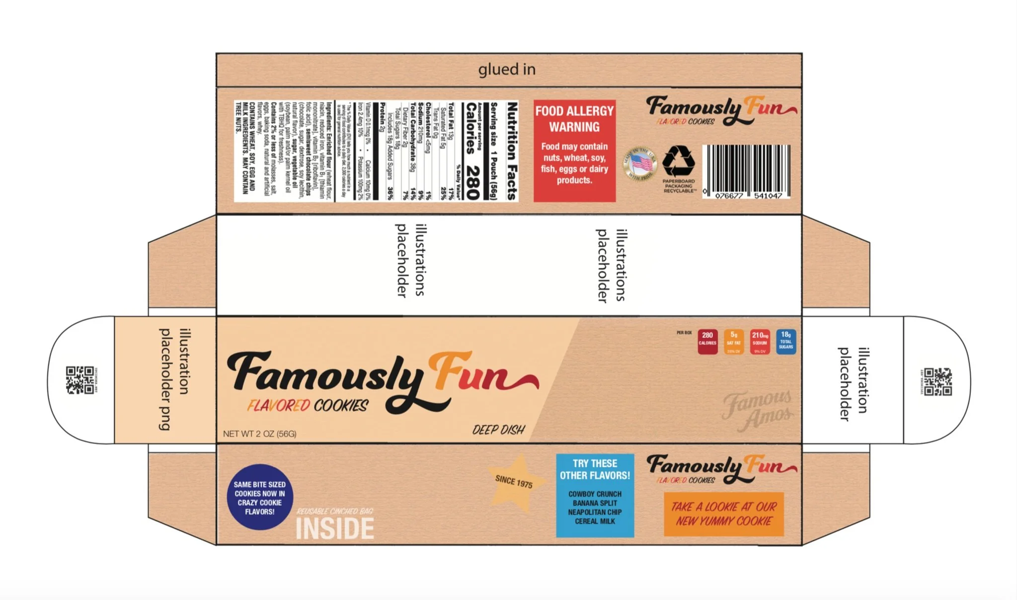
Initial Version & Packaging Elements
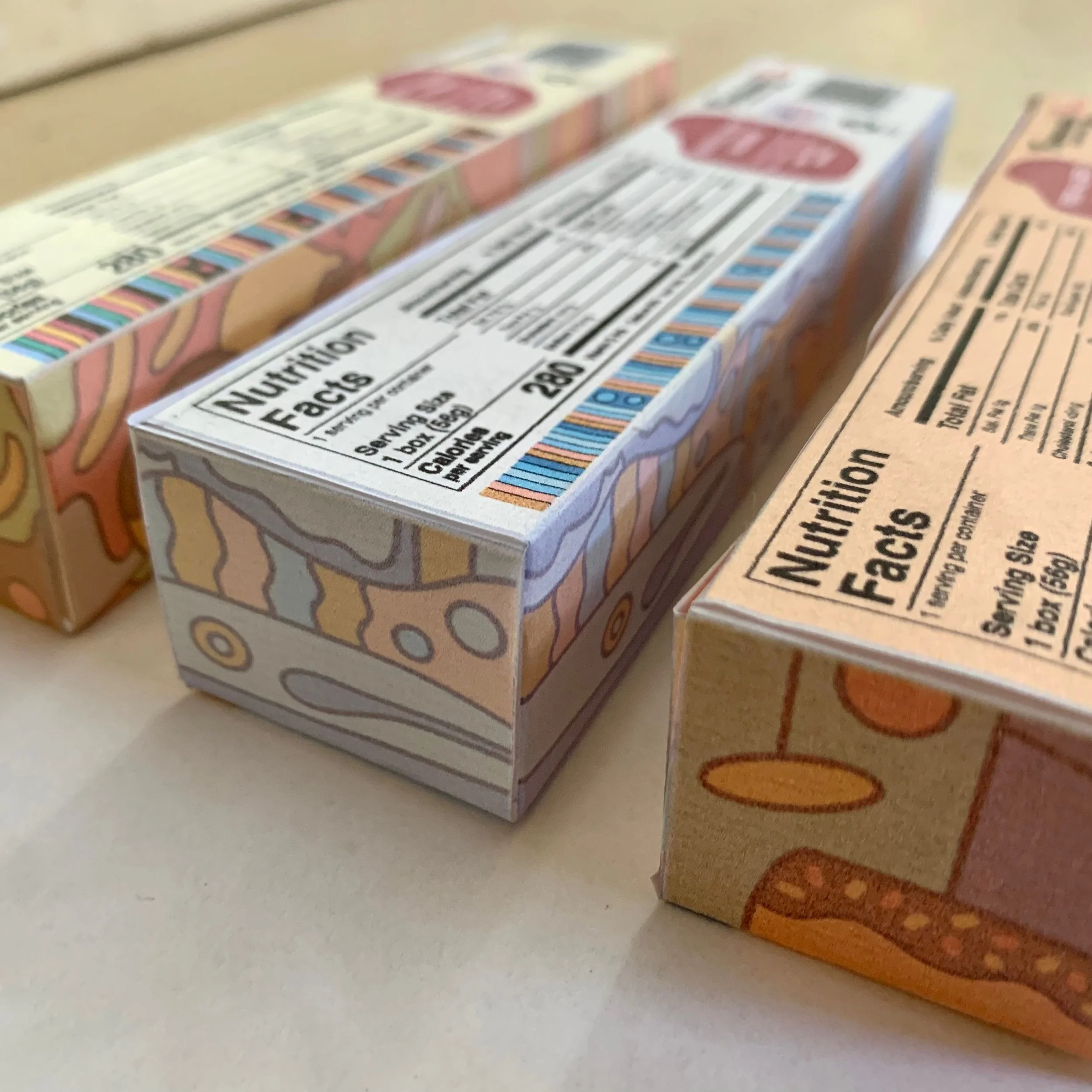
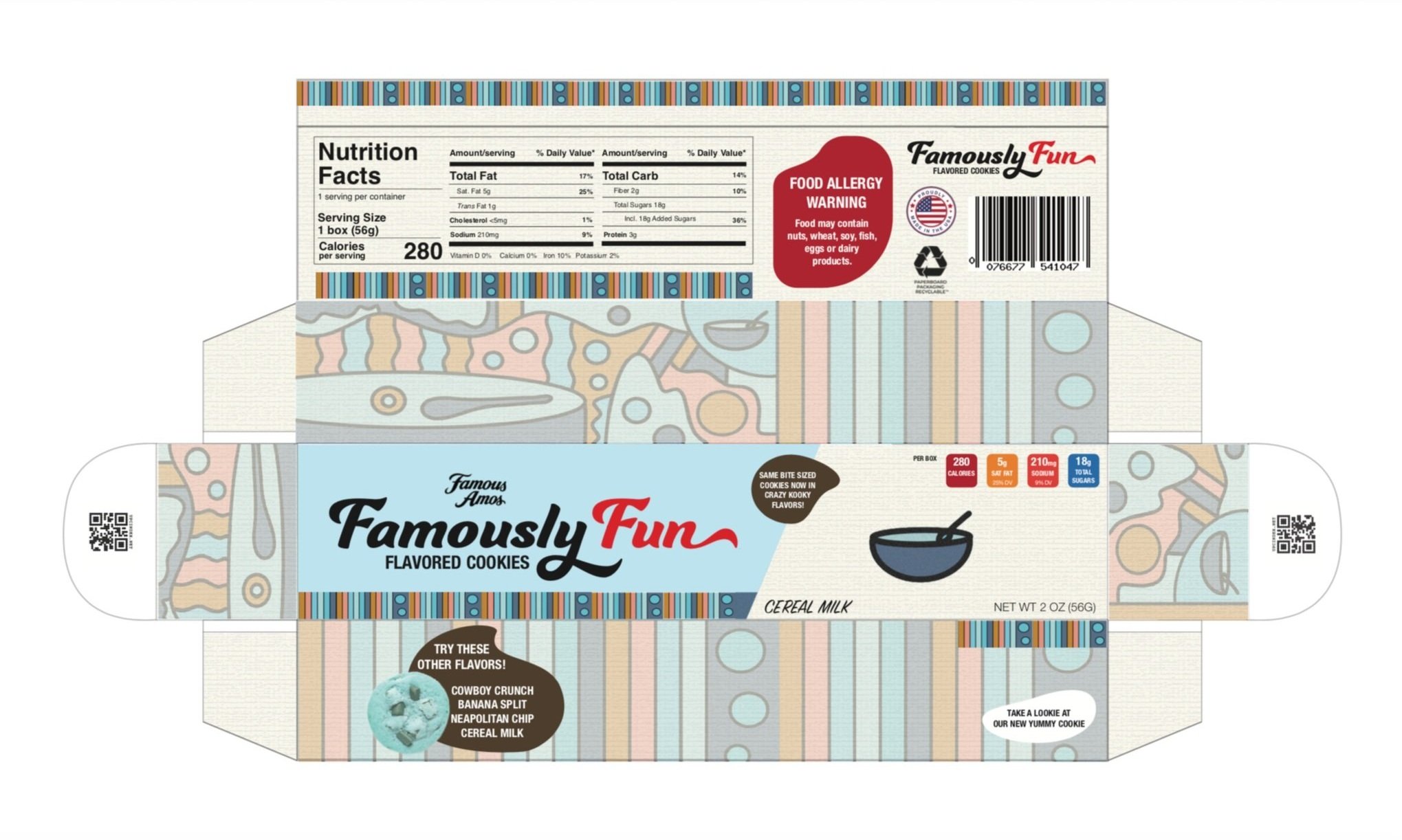
This version, especially with the finished design alongside it lacked finesse that took the work to the next level. The shape language on the bottom and back facing sides in this version are static and utilizes only simple shapes that do not enhance the design. Furthermore, these shapes do not encompass the type as well with gaps in-between that make the elements look digitally plastered without purpose. These elements could be improved to incorporate more breathing room and better separation & proportion between elements. The original brand logo can also interact with the sub-brand’s title typography in a more cohesive way. The nutrition label was also a placeholder where the final version would be made & curated by hand based on industry standard research on FDA approved nutrition labels.
-
Final Version & Packaging Elements
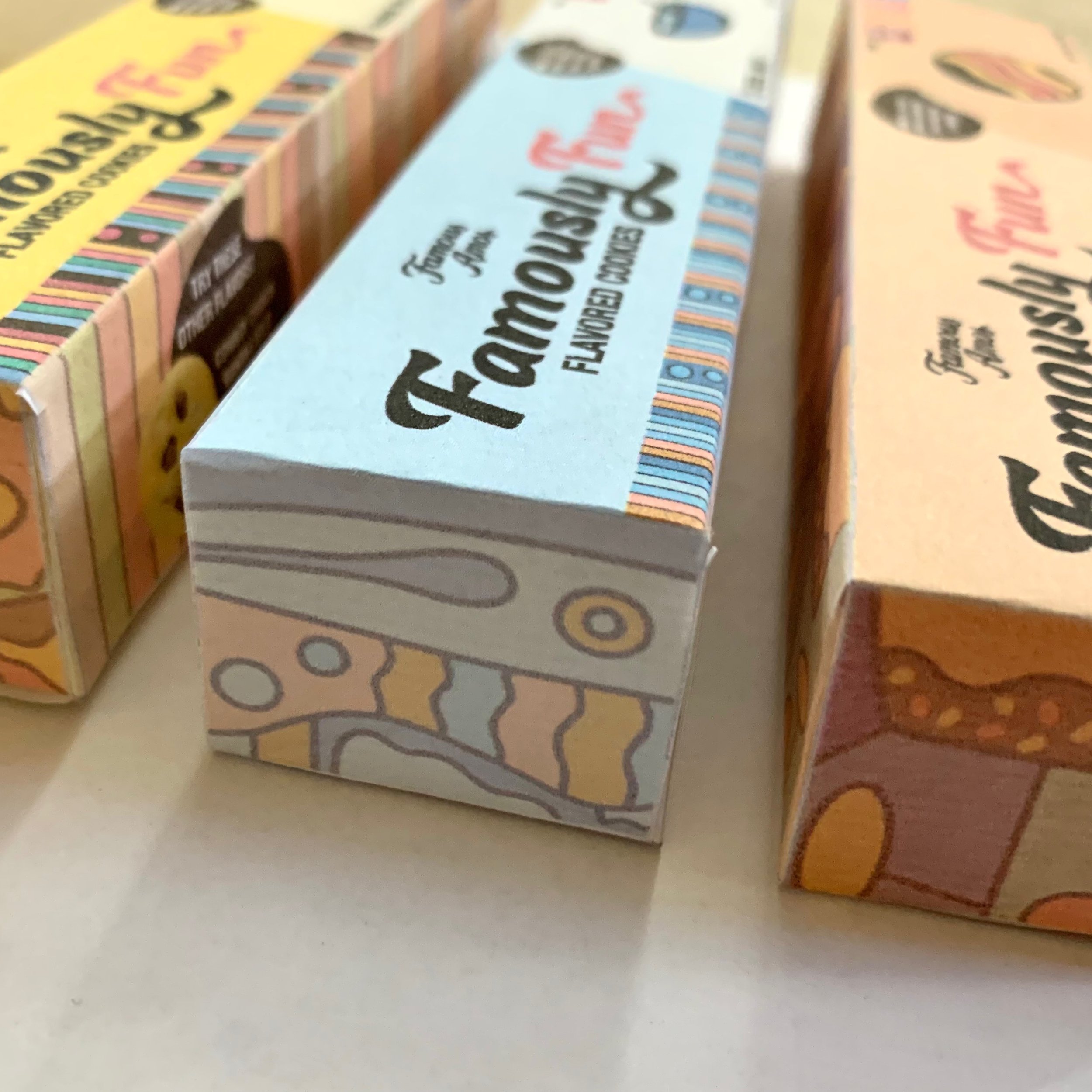
The final version of this design, which was emulated across all skews is sophisticated and playful compared to previous versions. Abstracting shape language was a vehicle that was utilized across all shapes encompassing smaller type elements. Placeholders were set on the previous version, however additional illustrative elements were added in several areas which made the design across the flavor variants pop. These elements were created by segmenting several parts of the bottom face of the package’s design that were then arranged, duplicated & minimized into a pattern. The multi-colored type was changed to be more bold and readable as well as the placement of design elements which were perfected from the previous version.