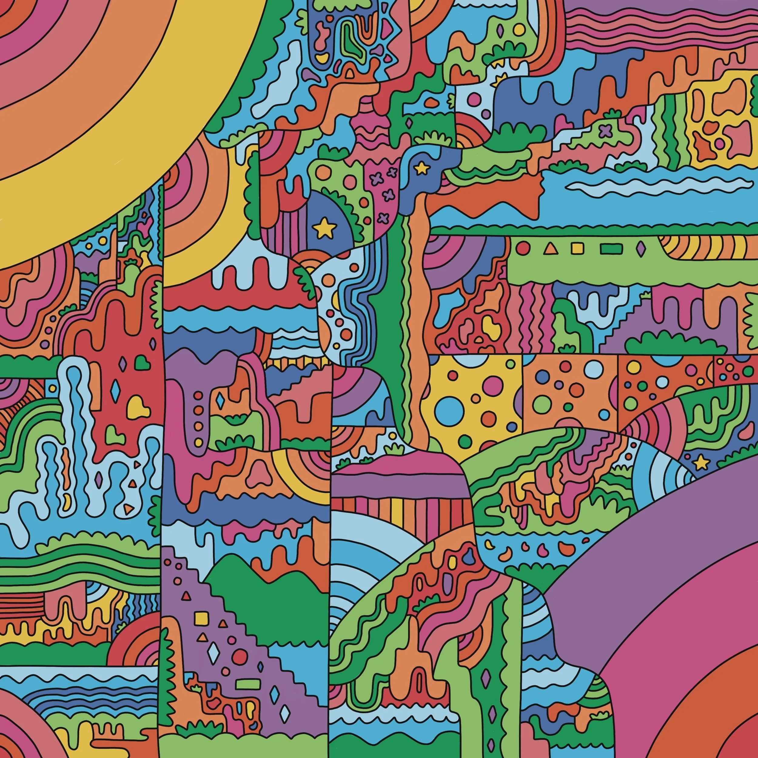
Superfluous Integrality Print & Surface Design
A curated, self-made illustration style that showcases print in an exciting way that can also be applied to surface design. The piece is intended to be bold, graphic and playful. Detail reinforces the nature of the piece with complexity that is simplified yet grouped together maximally. Inspired by the 60s, 70s & 90s as it relates to color and shape, the palette used in the artwork paired with organic & geometric elements are significant to the desired tone of the work which compliments both modern & contemporary art. Using a digital medium also showcases a contemporary modality in the scope of modern abstract influences. Two dimensionality as it relates to the surrounding tone of Topanga California connects the application of this piece to the ideas I love & who I am. Gradually closing in, each element becomes a part of the greater whole, with pinks and purples to represent flesh and an inner spirit paired with warm tones to radiate light, life and passion with prominent pockets of greens and blues to showcase how we are bound to nature and Mother Earth.